Anniversary Edition of a Classic: Part 2

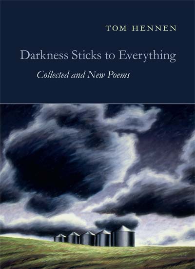
What poetry books looked like in the 60s

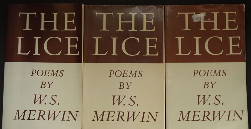
A look at The Drunk in the Furnace (1960, The Macmillan Company) beside The Lice (Athaneum, 1967) gives a sense of how Merwin’s poetry books, and that of many other poets, looked in the 50s and changed in the 60s.

MerwinFurnaceLice
Fig. 1: The Drunk in the Furnace, 1960 with The Lice, 1967

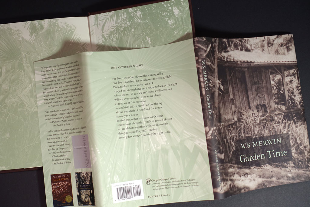
Side by side, we can see that Harry Ford’s design is a departure from the corporate feeling of The Macmillan Poets series design (credit Gilbert Etheredge). Ford’s design embraces letterpress aesthetics with bold, traditional letterforms. The Macmillan book is perfect bound and glued. The poor quality paper is now browned with age. The Lice on the other hand, is on laid stock with sewn signatures. It opens and lays flat without breaking the spine. It is a nice book! The prices: $1.25 and $1.95. I’d say Ford gave us that extra 70 cents worth.

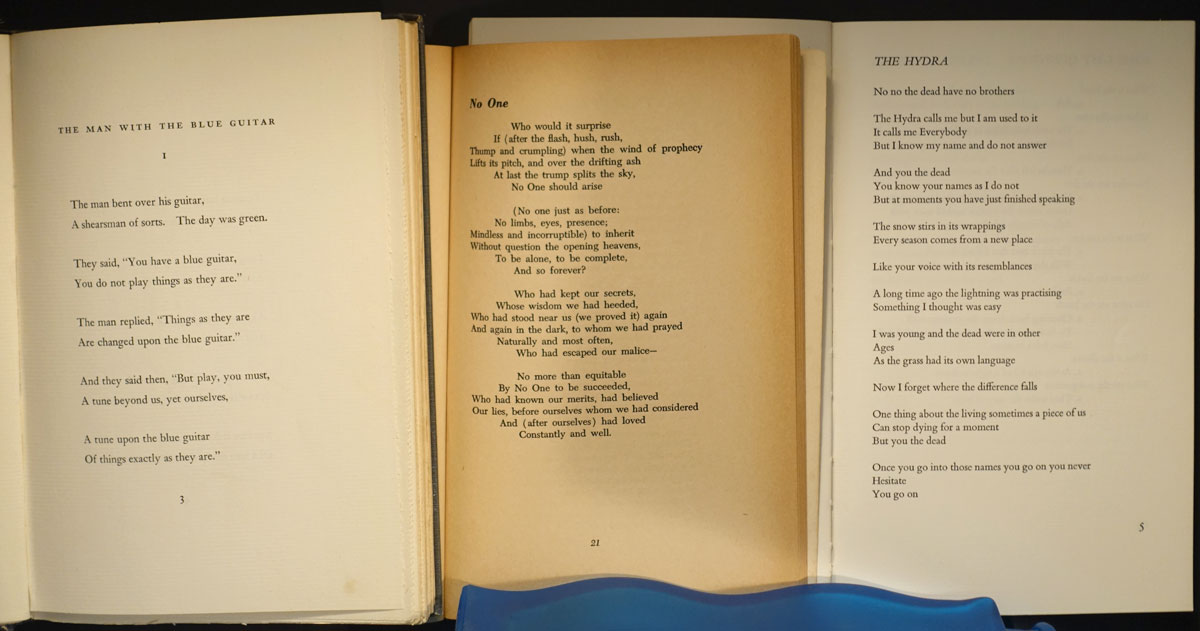
Take a look at the interiors. I’ve added a design from the 1950s on the left:

3bookComparison
Fig 2: At the left: Wallace Stevens, publshed by Knopf in 1952. In the middle: Merwin’s The Drunk in the Furnace, 1960. At the right: The Lice, 1967

In context, Harry Ford’s design belongs in the lineage of fine book design from Knopf (Atheneum was founded by Alfred A. Knopf, Jr. in  1959). Harry Ford had been a production manager at Knopf, but had been hired away to become production design director of the new Athaneum.

Known for his 1993 quip about poetry publishing: a money-losing proposition, Ford supported and edited poetry throughout his publishing career. The crafty exhuberance of his design for The Lice signals that the 1960s were in full bloom.

The Lice interior design uses metal-type thinking, i.e. common metal set sizes with even leading: 10/14 Bembo text, 14 pt cap italic titles and, notably, 14pt folios.* Everything hangs from the top of the page except second pages of poems and the epigram opposite the title page. The title page doesn’t center on the entire page, but is blocked up to the upper right. Seems a strange choice to my eye. My guess is that Harry Ford had a set of specs he handed to the compositor, and they took care of the rest. The frontmatter items have some interesting features, like the small cap book titles in the acknowledgments on the copyright page. There, someone seems to have given the work extra attention, and these pages are especially beautiful in the first edition, where the type was fresh and the paper stock fine.

*You can see those folios above in Figure 2. above. The page at the left shows the 14pt folio. These large folios were popular in the 60s-70s, and they have a certain appeal in that they show off the typeface’s numerals and make a nice anchor for the poetry page frame, which may have a large portion of whitespace. When I tried to use those anchor-sized numbers early in my career at Copper Canyon Press, Sam Hamill told me that he did NOT like them. So, I didn’t use them. I’ve come to agree with him that the large folios are a wayfinding element, outside the text, that has been made precious by the designer.

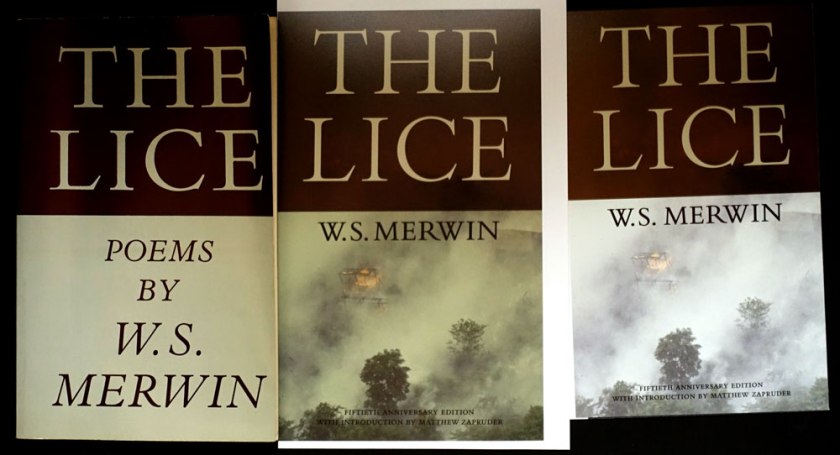
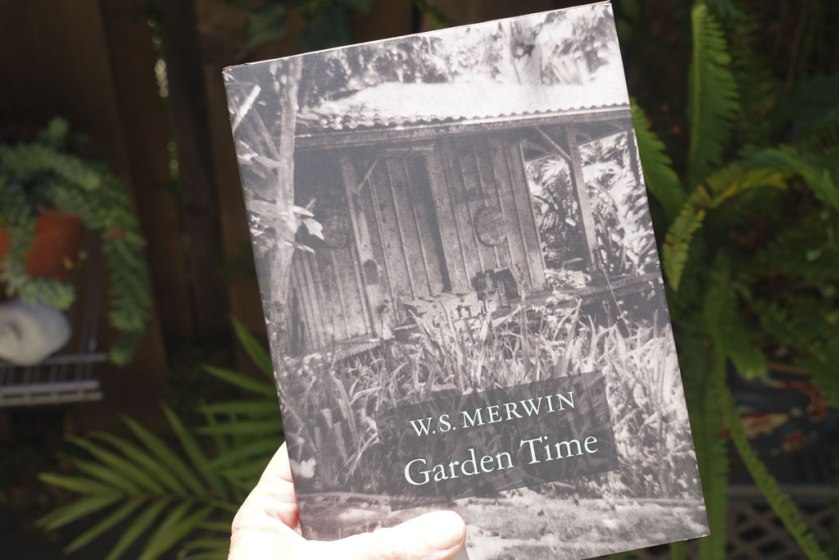
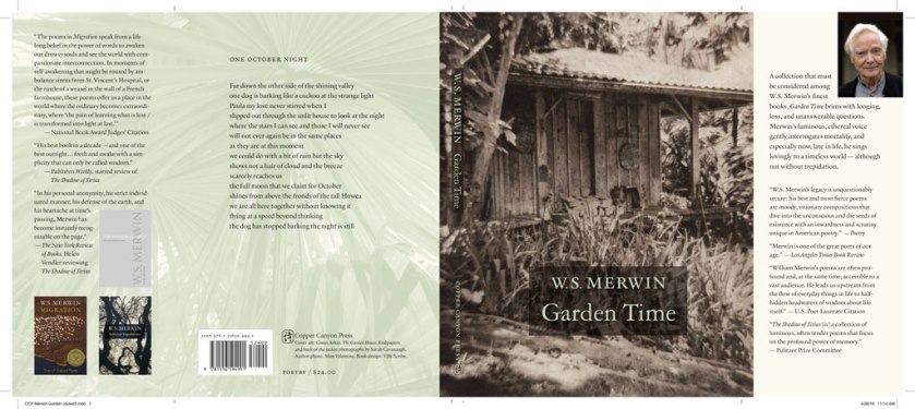
The Lice by W.S. Merwin: 50th Anniversary Edition

A great essay about Harry Ford and Cynthia Krupat, and how they are part of our experience of poetry

Read Part 1


Save

Anniversary Edition of a Classic: Part 1

The of burning village in Viet Nam suggests the context of the original and is also sadly like our own urgent canvas,with our great wildfires, and endless wars.

Designing a refreshed, enhanced edition of W.S. Merwin’s The Lice

In 1967, Atheneum published the first hard and softcover editions of The Lice. I’ve been designing the new 50th Anniversary Edition for Copper Canyon Press, and the project has taken me down all kinds of interesting rabbit holes. I plan to post about a few of them.

Considering the original cover:

As delivery to the printer approaches, I am still trying to nail down the color for the cover. I thought I had it, based on two old copies I had, but then thought to look at a first printing to see what materials they used.

FirstThirdTwelfthPrintings
L to R: First, third and twelfth printings

When my copy arrived, it seemed to me that the first printing was a different color than the later printings. Taking note of how yellowed the inside cover of the first printing appeared, I wondered if it had been printed on a natural white to start with?

It was difficult to match the color using my current Pantone Plus system swatch book book. In frustration I pulled out my very old Pantone CMYK book. There, I found some credible matches to the warmish greenish gray and the oxblood brown. I began to wonder if it wasn’t a good thing I’m too cheap throw out my old swatch books. Does the paper under the ink yellow as much as that without ink? Or perhaps, I was now thinking, each printing and even each copy had aged in its own way. . . .

Here is the first printing next to my Gracol6 proofs:

LiceColorProofs
L to Right: First, Gracol proof 2 (designed to be more tan), Gracol proof 1 (before I decided to make the bottom look more like the original book color)

The updated proofs are in the middle and on the right. I hope those of you who remember the original paperback will immediately recognize that rad title, (there isn’t a poem named “The Lice” in the collection), while new readers will appreciate those gorgeous elegant Bembo caps, and be drawn in by the photo. The of burning village in Viet Nam suggests the context of the original and is also sadly like our own urgent canvas, with our great wildfires, and endless wars.

Monotype’s Bembo Titling caps are so graceful (look the serifs on the “C”), they are an improvement to the original, heavier Bembo caps. To my eye, the bottom half of the original with those cap italics, desperately needed an update. I’ve never been a fan of all cap italics. They are all over the interior, too . . .

I’m going to adjust the cover color one more time . . .  I know, who even cares about this? {I do.} Who would ever notice? {Why I blog.}

On to Part 2


Save

Design notes from Merwin’s Garden Time (Copper Canyon Press)

W.S. Merwin’s latest poetry from his palm sanctuary

W.S. Merwin turned 89 on September 30, 2016.

gardentimecoverinsitu
Garden Time by W.S. Merwin, Copper Canyon Press, 2016, ISBN 978155659-499-1

The cover image, a copperplate photogravure by Gwen Arkin, shows the potting shed on the land where W.S. Merwin lives, writing and tending a forest of palm trees that he planted, turning clear cut land into a forest. Sarah Cavanaugh‘s photographs are on the endsheets and on the back of the jacket. Merwin’s Maui forest is now The Merwin Conservancy. 

Interior

Merwin’s poetry asks for a classic, minimal setting. MVB Verdigris is the text typeface, with display type set in Garamond 3. The Garamond siblings are a nod to Merwin’s years living in France if anyone were to ask me why I picked them. If you listen to that clip under the “living in France” link you’ll hear: warmth and erudition are in Merwin’s voice as well as in Verdigris’ letterforms.

ccpmerwingardenjacket3

gardentimebackendsheetcompare
The real book is better than the pictures. 5.5 x 7.5 inches, soft to the touch, fits well in hand . . .

Cover and Jacket

The cover art led the way to an earthy, organic approach for the whole book package. For the forest photos by Sarah Cavanaugh, printing them in full color seemed too literal, and possibly overwhelming to the space of the poems. Instead those photos are presented in a muted green monotone. I used 4-color process for the green so I could attempt to make both greens match (the one printed on the creamier endsheet stock and the one printed on the white jacket stock). By pulling back the yellow a bit on the endsheet green, the result matches well enough.

The original cover concept was whisper spare. Just the simple author/title. No enhancement. Test prints and common-sense talk* from JB the seasoned marketer convinced me that we had to make it possible to read the author/title from a distance. I used an understated intervention, a brown rectangle made from the image of a palm leaf.

*actually a passionate plea

merwingardentimecompare
Better choice?

Bloodaxe in Britain has released Garden Time in softcover. Their approach to the cover is a bit different, although they use the same image as a starting point.

Reviews:

Purchase directly from Copper Canyon Press.

Save

Luxury Matte and color shift

In the photo below, you can see how the color is darker and duller in the finished book  (left) than it is in the press approval proof (right) provided by the printer. The cover was printed offset (10pt C1S, 4/0) and finished with luxury matte coating.

comparison of color in matte lamination cover vs. pressmatch
Printed book with luxury matte coating on the left, matchprint from the printer on the right.

The printer always tells me that matte coatings will make the color darker, and it is useful to consider this side-by-side comparison. The cover stock is not as bright white as the proof stock. The cover stock is warmer (more yellow). So, some color shift is due to the difference in the stock.

On screen the image looks very bright (yes I know the screen doesn’t give an accurate color match). I had already made the image brighter and a bit more saturated to come closer to our expectations from the screen. I’m glad I did as the printed cover stepped it back down again.

Design note to self: Remember to think ahead and account for the likely difference between press proof and actual printed results.

Possible strategies: pull back the yellow 5%-10%, increase brightness and saturation, and in some circumstances pay for a proof on the actual stock for a better proof to begin with.

Design for Finding Them Gone

“The exquisite production quality of the book effectively highlights both his talents as translator and his vision as a travel writer.”—Justin Radland, The Los Angeles Review of Books

Finding Them Gone: Visiting China’s Poets of the Past by Bill Porter / Red Pine
400 pages, over 120 photos, 7 x 9 softcover
Finding Them Gone by Bill Porter/Red Pine

The book is organized around the story of Bill Porter’s Guggenheim award project. He traveled around China, visiting sites related to poets and offering libation to their spirits. It is a combination of travelogue, translation, and commentary where each chapter represents one of thirty days on a whirlwind tour.

FTGii-iii

The title page spread suggests the dizzying array of gravestones, pagodas and memorial halls visited during the journey, as well as the impressive list of Bill Porter/Red Pine’s published works.

Pages include poems in English and Chinese, images and captions. Wayfinding consists of running feet that tell the day number of the current page and he poet discussed on the page.

We wanted a book that you could open at random and jump in. Read a poem, take up the story, enjoy a photo.

FTG318-319

FTG58-59

From over 400 photos, Bill Porter and I culled down the lot. Layout of the book was done organically as I flowed the text and sized the photos into the five basic photo shapes I established within the design grid. All of the photos were adjusted for at least -10% in the shadow. Most photos required individual attention.

This book was unusual in that the design evolved as we developed first a single-chapter fundraiser and then adjusted that design to fit more lines on the page for the book. The book is printed on antique white rather than bright white stock, a choice that puts the words before the photos, and is consistent with other Copper Canyon Press titles.

fundraising sample and test of color for the cover
Finding Them Gone fundraising sample and 3 color proofs of the cover as I adjusted the final color.

You can order a copy of your own, direct from Copper Canyon Press.

Stonehouse Is in the House

StonehouseTitlex672

The Mountain Poems of Stonehouse, translation and commentary by Red Pine published by Copper Canyon Press.

Thinking of Eric Gill, and his background as a stonecutter, I set the book title with Gill’s beautiful Perpetua Titling capitals. I fell in love with the shapes of the letters, I admit.

Then, we found the image of the man in his simple hut, in the midst of dragon-shape pine trees. After acquiring the image rights, we learned that this scene was a detail from the  familiar painting, “The Thatched Hut of Dreaming an Immortal” by Tang Yin (late 16th C), the wide painting depicts a man hovering in space at the left side. The Immortal hovers just beyond the book cover too.

StonehouseSoft

The interior design balances the vertical lines of Chinese and the dense commentary on the verso pages with the poem number and translation on the recto page. All along, we wanted to keep the attention on the poems, with no more than 2 poem per spread.

I selected Minion for the text, as the sections of commentary can be long and we had limited space. Minion is slightly condensed so fits more words on the page than Bembo (another face I considered). Why not Perpetua for the text? Aside from the problem of fitting commentary, I don’t use Perpetua anymore for text because it falls apart when printed POD, and even though this book was printed on web press (at McNaughton and Gunn), you never know how the text may be printed in future.

The Mountain Poems of Stonehouse
Copious notes and commentary are part of what make Red Pine’s books so great.
The Mountain Poems of Stonehouse: spread 2
Stonehouse: The page has to work with less text, too.

Multilingual books are always full of puzzles to solve. In this case the poems contain some archaic characters, so we relied on a compositor in Taiwan to compose the Chinese. Delivered as a PDF, each page contained several poems. I placed the PDF and cropped out the other poems. Midway through, the Chinese compositor changed the spacing and organization of the source pdf changed. Aargh! I had to relink and check and recrop all those text boxes. What are blogs for if not for complaining, right?

I’ll end with one of my favorite poems from this collection:

Poem 13, by Stonehouse
Poem 13 by Stonehouse, translated by Red Pine


To buy a copy of the book, buy direct from Copper Canyon Press, or browse your local bookseller.


Paris Was a Woman

In 2013, Counterpoint Press asked me to design the reissue of Andrea Weiss’ richly illustrated history of the Paris cultural scene in the 1920s and 30s.

WeissSpread1

WeissSpread2


WeissSpread3

WeissSpread4

About the design

The book includes many illustration in the form of photographs and documents. I was grateful for the previous editions as they provided a plot to follow for the sequence of the illustrations. The trim size was different from the previous, and the schedule was short. I knew I had to accomplish the best layout on the first page proof as there wasn’t time to rework. I chose a 5 column grid for a lively asymmetry.

To approach the text design, I did some research.  As usage lags invention, typography from the Belle Epoque and were still used in signage and publications from the time covered by the book, so I included those influences in my type palette. I used Fontshop’s FontBook app to browse typefaces designed in the 1910-1940 period.

For the text I chose Stemple Garamond, a beautiful Garamond (Stemple, 1924). I like to think that the date a typeface is created has some of the DNA of its time. For the display type, I chose Handle Oldstyle (1917), designed by a rare woman typographer. Handle pairs nicely with the letterforms of the Garamond.

For subheads and running feet I chose Cooper Oldstyle Italic, a stalwart of advertising of the time period, and Quadraat. Quadraat Sans has a bit of deco in it and a bit of warmth.

Stemple Garamond
Handle Oldstyle
Quadraat Sans Semibold
Cooper Oldstyle Italic

Many of the photos were scanned from books, or rough scans from the photos and so needed attention to adjust the gray tones and bring details out of the shadows.

This is a wonderful book. While I was familiar with Gertrude Stein and Shakespeare Books, there were many other women, such as Janet Flanner and Djuna Barnes, who contributed to the cultural milieu that was expat Paris in the 1930s.

Here’s a link to the author’s website, where there is a link to purchase the book:
andreaweiss.net/books/paris-was-a-woman/

Book appears in the New York Times

It has been an exciting week, with a review of Tom Hennen’s Darkness Sticks to Everything in the New York Times along with a photo of the book.

While designing the book, I grew to love the poems and have been telling all my poetry friends to read Tom Hennen. Well, the book is now out, and I hope is reaching many new readers.

For this title, we found another great cover image in the work of Susan Bennerstrom. I chose a smaller trim size, that fits the generally brief poems and prose poems well. You might even carry this in your coat pocket.

Image

Image

%d bloggers like this: