How do I become a book designer?

It happens while you are making other plans . . .

I thought I was preparing for a career as a writer.

In high school, I discovered I enjoy being around printing presses and photography. When I was a senior, instead of taking AP courses at the community college, I used the opportunity to study graphic design and learn how to run a small offset printing press. In college, while studying for my BA in English, I looked for jobs in print shops, copy shops, and with publishers (where I could find them).

My job titles: copy shop manager, print shop gopher, bindery worker, word processor, typesetter, production artist, computer specialist, graphic designer, prepress expert . . . It wasn’t until I was well into my 40s that I looked around at my workload and my prospects and decided that my job title was finally Book Designer.

I don’t think my trajectory is uncommon. It is like that of book designer David Bullen.

Spontaneous generation?

Book designers are often born from pivotal situations:

  • An intern or assistant with visual and verbal sense communicates well and sparks ideas with the managing editor: a book designer is born.
  • A group of artists or activists decide to make a zine and turn to the person in their group with computer skills and a flair for color or illustration: a publication designer is born.
  • A writer or editor with a strong ideas learns InDesign or hires an assistant with skills: an art director is born.

Check out the origin story for Peter Mendelsund.

Your mission is to make such a pivotal situation more likely.

Choice, chance, and location, location, location

In my story, geography was key.

I lived at the epicenter of the personal computer revolution. My first job after graduation was at a publishing company at the cutting edge of technology. We had an Apple Lisa computer in our art department. Typesetting and graphic design were the first industries to flourish on microcomputers (as any computer that fit on or under a desk was called back then). I was one of the first that had that expertise, and my expertise was in demand.

I lived in metropolitan areas that were home to publishing companies. By living the Bay Area and Seattle, I had opportunities to expand my skills working for a variety of small publishers and a newspapers. In college I interned at a major publisher in San Francisco. I joined a vibrant professional organization, Bookbuilders West, that inspired me and helped me network. I took extension classes from local institutions in book design and calligraphy. My book design prospects would have been even better had I moved to New York City.

I was fortunate that my path led me to right place and right time to meet my best publishing clients. But, I had made many good choices that lead me to those chances. I suggest you do the same.

Expectations

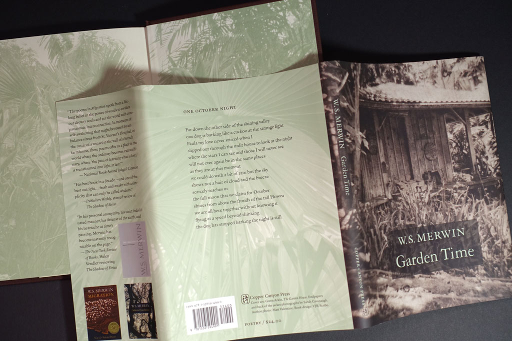
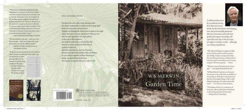
Book design is a very small subset of graphic design. You will possibly be designing other types of materials and that are mundane (not books, not literary, not scholarly). Students like to design covers for Moby Dick or other literary titles. Try Medically Unexplained Illness: Gender and Psychosocial Issues.

Graphic design and much of book design is not art. A few talented people work with dream teams that allow the designer to rule and have budgets to help them achieve extraordinary results. What they design is art, but don’t beat yourself up too much because that art rests on extraordinary support.

Book design is both cover and interior design. I am a bit nerdy and like the challenge of complex interiors where the job is to develop systems and hierarchies. In today’s world of interior design, you may be surprised how much of interior design has grown to be like programming and web design.

I’ve found my work life made of letters very satisfying. Book design is a “deep” discipline. By that, I mean there is history, tradition, methods, practices, multiple audiences and forms, and continual changes in methods. While some aspects might be described as monotonous, there is plenty of drama, and lots of room for meaning.

So, how to become a book designer?

Start where you are and build your experience and skills. If you can get paid at the same time, great! There are schools that teach all the aspects of book design, or you can choose to study only what you need. Continue adding to your experience and moving toward opportunities to build a portfolio.

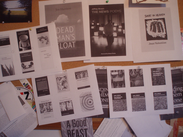
  • Refine and practice your visual skills (typography, illustration, display of graphic information). Look deeply at books.
  • Learn about the business and practices of publishing.
  • Learn the how to use the tools and materials.
  • Build portfolio of designs that show you can do the kind work you are seeking.

Here is some great advice from a book designer who has contemporary experience:

Today, you can practice by producing your own book. Print-on-demand technology makes it possible to build a portfolio and learn at the same time. Undertaking your own book project will teach you so much!

And this.

Most of what you do as a book designer is please your clients. I intentionally use the plural “clients.”

Unless you are self-publishing zines or chapbooks, each book is built by a team.

The most important skills you have may not be your exquisite sense of color, or style, or efficient way of executing alterations. Showing up, understanding what your client wants, guessing what your client wants when they don’t know how to tell you, and balancing the desires of various stakeholders must be part of your way of working.

Book design is relationships. Book people make great colleagues.

More questions? Let me know.

Hierloom Books

Let’s make an heirloom book from your genealogy research, scrapbooks, photos, collected letters, or memoir.

Do you have genealogy research, or a collection of letters, poems, or photos that you would like to preserve as a book you can share? I can help you edit your material and form a book that will be a “keeper.” Here’s a recent project:

GoldofGreenstoneSQ550x
The Gold of Greenstone Glen, 5.5 x 8.5, 260 pages

From a box of mementos to a book

My client found the manuscript of a novel written by her ancestor. She wanted to make this special find something to share with her famiy as a book. She came to me asking if she could make 10 books bound in green leather.

After seeing the manuscript, I suggested she write an Introduction for the book, with the story of how she found the manuscript, and any other information she wanted to add. She showed me a framed newspaper article written about her relative. It was illustrated with a map of his worldwide travels — and he went everywhere! My client also had a photograph of her relative: a hunting scene in a small sepia print.

That photo, enlarged, became the front endsheets. This worked out well because on the enlargement, it is possible to see the man’s features, now visible due to high-resolution printing. The back endsheets are filled with the family tree, with room for the grandchildren to fill in the new members as they pass the book along.

With the Introduction, photos, map, and the novel, someday when somebody finds the book in grandma’s garage, the book will tell the story on its own.

Editions as low as 10 copies

From a printing standpoint, the challenge was to find a way to do so few books, and to find a way to satisfy my client’s wish for leather-bound books. Fortunately it is easier than ever to print very small quantities of books.

EditionOne

EditionOne is a quality digital print shop and bindery in Berkeley, CA. The Gold of Greenstone Glen is the first project I’ve done with them, and I hope to do many more. Their array of materials and finishes is a candy shop for book designers and they will produce as few as 10 books.

I visited their workshop to see examples of their work, and select a case material for my client’s book project. From their samples I could see that their bindery did a fabulous job: tight yet yielding binding, crisp foil stamping, and perfect detail work on corners and endsheets. With their guidance, I considered the leather and leatherlike options. I then explained the options to my client.

With relatively modest case stamping on leatherlike material, black and white interior, and color endsheets, we were able to keep the cost per book very close to $100/book.

Edition One provided proofs on the actual stock and produced the books in a timely manner. The books were packed beautifully in high-quality cartons.

Ready to make your heirloom?

Get in touch.

Anniversary Edition of a Classic: Part 2

What poetry books looked like in the 60s

A look at The Drunk in the Furnace (1960, The Macmillan Company) beside The Lice (Athaneum, 1967) gives a sense of how Merwin’s poetry books, and that of many other poets, looked in the 50s and changed in the 60s.

MerwinFurnaceLice
Fig. 1: The Drunk in the Furnace, 1960 with The Lice, 1967

Side by side, we can see that Harry Ford’s design is a departure from the corporate feeling of The Macmillan Poets series design (credit Gilbert Etheredge). Ford’s design embraces letterpress aesthetics with bold, traditional letterforms. The Macmillan book is perfect bound and glued. The poor quality paper is now browned with age. The Lice on the other hand, is on laid stock with sewn signatures. It opens and lays flat without breaking the spine. It is a nice book! The prices: $1.25 and $1.95. I’d say Ford gave us that extra 70 cents worth.

Take a look at the interiors. I’ve added a design from the 1950s on the left:

3bookComparison
Fig 2: At the left: Wallace Stevens, publshed by Knopf in 1952. In the middle: Merwin’s The Drunk in the Furnace, 1960. At the right: The Lice, 1967

In context, Harry Ford’s design belongs in the lineage of fine book design from Knopf (Atheneum was founded by Alfred A. Knopf, Jr. in  1959). Harry Ford had been a production manager at Knopf, but had been hired away to become production design director of the new Athaneum.

Known for his 1993 quip about poetry publishing: a money-losing proposition, Ford supported and edited poetry throughout his publishing career. The crafty exhuberance of his design for The Lice signals that the 1960s were in full bloom.

The Lice interior design uses metal-type thinking, i.e. common metal set sizes with even leading: 10/14 Bembo text, 14 pt cap italic titles and, notably, 14pt folios.* Everything hangs from the top of the page except second pages of poems and the epigram opposite the title page. The title page doesn’t center on the entire page, but is blocked up to the upper right. Seems a strange choice to my eye. My guess is that Harry Ford had a set of specs he handed to the compositor, and they took care of the rest. The frontmatter items have some interesting features, like the small cap book titles in the acknowledgments on the copyright page. There, someone seems to have given the work extra attention, and these pages are especially beautiful in the first edition, where the type was fresh and the paper stock fine.

*You can see those folios above in Figure 2. above. The page at the left shows the 14pt folio. These large folios were popular in the 60s-70s, and they have a certain appeal in that they show off the typeface’s numerals and make a nice anchor for the poetry page frame, which may have a large portion of whitespace. When I tried to use those anchor-sized numbers early in my career at Copper Canyon Press, Sam Hamill told me that he did NOT like them. So, I didn’t use them. I’ve come to agree with him that the large folios are a wayfinding element, outside the text, that has been made precious by the designer.

The Lice by W.S. Merwin: 50th Anniversary Edition

A great essay about Harry Ford and Cynthia Krupat, and how they are part of our experience of poetry

Read Part 1


Save

Anniversary Edition of a Classic: Part 1

The of burning village in Viet Nam suggests the context of the original and is also sadly like our own urgent canvas,with our great wildfires, and endless wars.

Designing a refreshed, enhanced edition of W.S. Merwin’s The Lice

In 1967, Atheneum published the first hard and softcover editions of The Lice. I’ve been designing the new 50th Anniversary Edition for Copper Canyon Press, and the project has taken me down all kinds of interesting rabbit holes. I plan to post about a few of them.

Considering the original cover:

As delivery to the printer approaches, I am still trying to nail down the color for the cover. I thought I had it, based on two old copies I had, but then thought to look at a first printing to see what materials they used.

FirstThirdTwelfthPrintings
L to R: First, third and twelfth printings

When my copy arrived, it seemed to me that the first printing was a different color than the later printings. Taking note of how yellowed the inside cover of the first printing appeared, I wondered if it had been printed on a natural white to start with?

It was difficult to match the color using my current Pantone Plus system swatch book book. In frustration I pulled out my very old Pantone CMYK book. There, I found some credible matches to the warmish greenish gray and the oxblood brown. I began to wonder if it wasn’t a good thing I’m too cheap throw out my old swatch books. Does the paper under the ink yellow as much as that without ink? Or perhaps, I was now thinking, each printing and even each copy had aged in its own way. . . .

Here is the first printing next to my Gracol6 proofs:

LiceColorProofs
L to Right: First, Gracol proof 2 (designed to be more tan), Gracol proof 1 (before I decided to make the bottom look more like the original book color)

The updated proofs are in the middle and on the right. I hope those of you who remember the original paperback will immediately recognize that rad title, (there isn’t a poem named “The Lice” in the collection), while new readers will appreciate those gorgeous elegant Bembo caps, and be drawn in by the photo. The of burning village in Viet Nam suggests the context of the original and is also sadly like our own urgent canvas, with our great wildfires, and endless wars.

Monotype’s Bembo Titling caps are so graceful (look the serifs on the “C”), they are an improvement to the original, heavier Bembo caps. To my eye, the bottom half of the original with those cap italics, desperately needed an update. I’ve never been a fan of all cap italics. They are all over the interior, too . . .

I’m going to adjust the cover color one more time . . .  I know, who even cares about this? {I do.} Who would ever notice? {Why I blog.}

On to Part 2


Save

Design notes from Merwin’s Garden Time (Copper Canyon Press)

W.S. Merwin’s latest poetry from his palm sanctuary

W.S. Merwin turned 89 on September 30, 2016.

gardentimecoverinsitu
Garden Time by W.S. Merwin, Copper Canyon Press, 2016, ISBN 978155659-499-1

The cover image, a copperplate photogravure by Gwen Arkin, shows the potting shed on the land where W.S. Merwin lives, writing and tending a forest of palm trees that he planted, turning clear cut land into a forest. Sarah Cavanaugh‘s photographs are on the endsheets and on the back of the jacket. Merwin’s Maui forest is now The Merwin Conservancy. 

Interior

Merwin’s poetry asks for a classic, minimal setting. MVB Verdigris is the text typeface, with display type set in Garamond 3. The Garamond siblings are a nod to Merwin’s years living in France if anyone were to ask me why I picked them. If you listen to that clip under the “living in France” link you’ll hear: warmth and erudition are in Merwin’s voice as well as in Verdigris’ letterforms.

ccpmerwingardenjacket3

gardentimebackendsheetcompare
The real book is better than the pictures. 5.5 x 7.5 inches, soft to the touch, fits well in hand . . .

Cover and Jacket

The cover art led the way to an earthy, organic approach for the whole book package. For the forest photos by Sarah Cavanaugh, printing them in full color seemed too literal, and possibly overwhelming to the space of the poems. Instead those photos are presented in a muted green monotone. I used 4-color process for the green so I could attempt to make both greens match (the one printed on the creamier endsheet stock and the one printed on the white jacket stock). By pulling back the yellow a bit on the endsheet green, the result matches well enough.

The original cover concept was whisper spare. Just the simple author/title. No enhancement. Test prints and common-sense talk* from JB the seasoned marketer convinced me that we had to make it possible to read the author/title from a distance. I used an understated intervention, a brown rectangle made from the image of a palm leaf.

*actually a passionate plea

merwingardentimecompare
Better choice?

Bloodaxe in Britain has released Garden Time in softcover. Their approach to the cover is a bit different, although they use the same image as a starting point.

Reviews:

Purchase directly from Copper Canyon Press.

Save

%d bloggers like this: