

A look at The Drunk in the Furnace (1960, The Macmillan Company) beside The Lice (Athaneum, 1967) gives a sense of how Merwin’s poetry books, and that of many other poets, looked in the 50s and changed in the 60s.

Side by side, we can see that Harry Ford’s design is a departure from the corporate feeling of The Macmillan Poets series design (credit Gilbert Etheredge). Ford’s design embraces letterpress aesthetics with bold, traditional letterforms. The Macmillan book is perfect bound and glued. The poor quality paper is now browned with age. The Lice on the other hand, is on laid stock with sewn signatures. It opens and lays flat without breaking the spine. It is a nice book! The prices: $1.25 and $1.95. I’d say Ford gave us that extra 70 cents worth.
Take a look at the interiors. I’ve added a design from the 1950s on the left:

In context, Harry Ford’s design belongs in the lineage of fine book design from Knopf (Atheneum was founded by Alfred A. Knopf, Jr. in 1959). Harry Ford had been a production manager at Knopf, but had been hired away to become production design director of the new Athaneum.
Known for his 1993 quip about poetry publishing: a money-losing proposition, Ford supported and edited poetry throughout his publishing career. The crafty exhuberance of his design for The Lice signals that the 1960s were in full bloom.
The Lice interior design uses metal-type thinking, i.e. common metal set sizes with even leading: 10/14 Bembo text, 14 pt cap italic titles and, notably, 14pt folios.* Everything hangs from the top of the page except second pages of poems and the epigram opposite the title page. The title page doesn’t center on the entire page, but is blocked up to the upper right. Seems a strange choice to my eye. My guess is that Harry Ford had a set of specs he handed to the compositor, and they took care of the rest. The frontmatter items have some interesting features, like the small cap book titles in the acknowledgments on the copyright page. There, someone seems to have given the work extra attention, and these pages are especially beautiful in the first edition, where the type was fresh and the paper stock fine.
*You can see those folios above in Figure 2. above. The page at the left shows the 14pt folio. These large folios were popular in the 60s-70s, and they have a certain appeal in that they show off the typeface’s numerals and make a nice anchor for the poetry page frame, which may have a large portion of whitespace. When I tried to use those anchor-sized numbers early in my career at Copper Canyon Press, Sam Hamill told me that he did NOT like them. So, I didn’t use them. I’ve come to agree with him that the large folios are a wayfinding element, outside the text, that has been made precious by the designer.
The Lice by W.S. Merwin: 50th Anniversary Edition
A great essay about Harry Ford and Cynthia Krupat, and how they are part of our experience of poetry
The of burning village in Viet Nam suggests the context of the original and is also sadly like our own urgent canvas,with our great wildfires, and endless wars.
In 1967, Atheneum published the first hard and softcover editions of The Lice. I’ve been designing the new 50th Anniversary Edition for Copper Canyon Press, and the project has taken me down all kinds of interesting rabbit holes. I plan to post about a few of them.
As delivery to the printer approaches, I am still trying to nail down the color for the cover. I thought I had it, based on two old copies I had, but then thought to look at a first printing to see what materials they used.
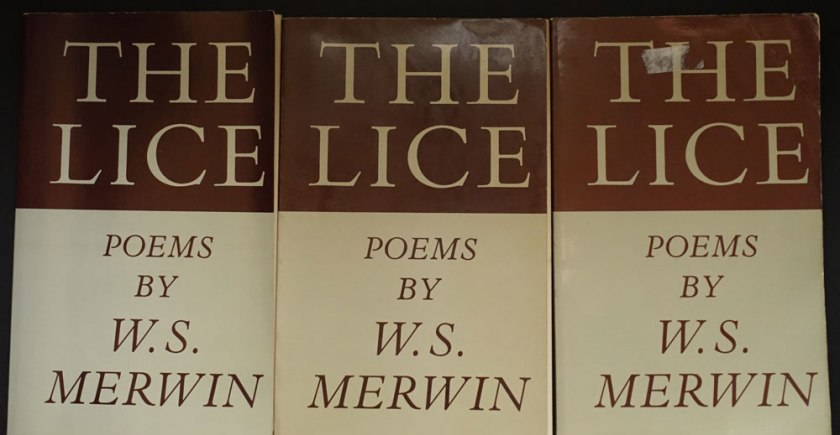
When my copy arrived, it seemed to me that the first printing was a different color than the later printings. Taking note of how yellowed the inside cover of the first printing appeared, I wondered if it had been printed on a natural white to start with?
It was difficult to match the color using my current Pantone Plus system swatch book book. In frustration I pulled out my very old Pantone CMYK book. There, I found some credible matches to the warmish greenish gray and the oxblood brown. I began to wonder if it wasn’t a good thing I’m too cheap throw out my old swatch books. Does the paper under the ink yellow as much as that without ink? Or perhaps, I was now thinking, each printing and even each copy had aged in its own way. . . .
Here is the first printing next to my Gracol6 proofs:
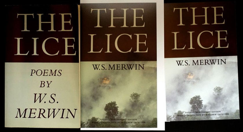
The updated proofs are in the middle and on the right. I hope those of you who remember the original paperback will immediately recognize that rad title, (there isn’t a poem named “The Lice” in the collection), while new readers will appreciate those gorgeous elegant Bembo caps, and be drawn in by the photo. The of burning village in Viet Nam suggests the context of the original and is also sadly like our own urgent canvas, with our great wildfires, and endless wars.
Monotype’s Bembo Titling caps are so graceful (look the serifs on the “C”), they are an improvement to the original, heavier Bembo caps. To my eye, the bottom half of the original with those cap italics, desperately needed an update. I’ve never been a fan of all cap italics. They are all over the interior, too . . .
I’m going to adjust the cover color one more time . . . I know, who even cares about this? {I do.} Who would ever notice? {Why I blog.}
W.S. Merwin turned 89 on September 30, 2016.
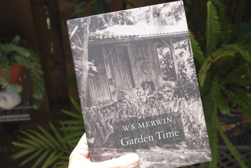
The cover image, a copperplate photogravure by Gwen Arkin, shows the potting shed on the land where W.S. Merwin lives, writing and tending a forest of palm trees that he planted, turning clear cut land into a forest. Sarah Cavanaugh‘s photographs are on the endsheets and on the back of the jacket. Merwin’s Maui forest is now The Merwin Conservancy.
Merwin’s poetry asks for a classic, minimal setting. MVB Verdigris is the text typeface, with display type set in Garamond 3. The Garamond siblings are a nod to Merwin’s years living in France if anyone were to ask me why I picked them. If you listen to that clip under the “living in France” link you’ll hear: warmth and erudition are in Merwin’s voice as well as in Verdigris’ letterforms.
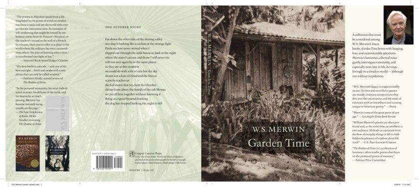

The cover art led the way to an earthy, organic approach for the whole book package. For the forest photos by Sarah Cavanaugh, printing them in full color seemed too literal, and possibly overwhelming to the space of the poems. Instead those photos are presented in a muted green monotone. I used 4-color process for the green so I could attempt to make both greens match (the one printed on the creamier endsheet stock and the one printed on the white jacket stock). By pulling back the yellow a bit on the endsheet green, the result matches well enough.
The original cover concept was whisper spare. Just the simple author/title. No enhancement. Test prints and common-sense talk* from JB the seasoned marketer convinced me that we had to make it possible to read the author/title from a distance. I used an understated intervention, a brown rectangle made from the image of a palm leaf.
*actually a passionate plea

Bloodaxe in Britain has released Garden Time in softcover. Their approach to the cover is a bit different, although they use the same image as a starting point.
Purchase directly from Copper Canyon Press.
Here’s a treasure from my hoard, a gorgeous type specimen for the Lanston Type Co. printed 25 years ago. Still inspiring!
The Fount, Volume 1, Issue 1, Gerald Giampa designer, The Northland Letterpress Co. Ltd. Publisher, 1991. Tabloid size, newsprint.
From the history on MyFonts.com: “Lanston continued supplying the American market for Monotype casters until January 21, 2000, when the hot-metal component of Lanston was tragically destroyed by a tidal wave. After this time Giampa, who was one of the earliest developers of PostScript fonts, focused much more on digitization.”
From the masthead: “We trust you will accept our efforts to entertain, to appeal to your eye, and to provide you with accurate historical and technical information which will assist with your work in the world of late 20th Century Typography.”
I received my first box of 4o copies of Bookbuilder’s Almanac: Volume One this week. I ordered these to send out to reviewers.
Up to now, I’ve only seen the book as a single-order printing. As you know, part of my objective with the Bookbuilder’s Almanac is to create a useful sample to show print quality.
Imagine my surprise when I surveyed my books and discovered that 16 were printed with inkjet technology and the remaining 24 were printed with toner-based printers.
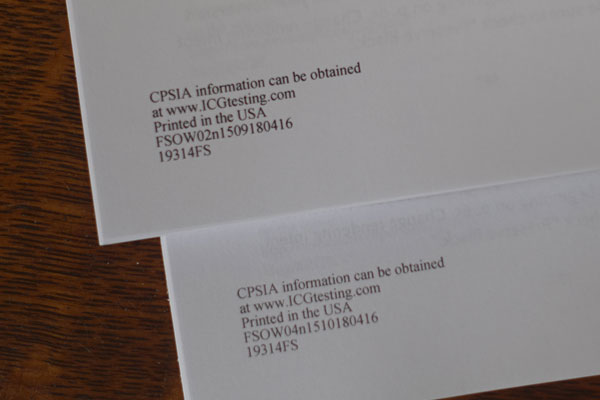
The toner versions are darker and sharper than the inkjet versions. The toner is shiny. The inkjet versions are smoother and not quite black enough. Some typefaces are better in one version than the other. Both versions have similar gray capacity.
[05.11.16: My friend Alan Gilbertson observed that the two versions are printed on different papers, “a fairly opaque bright white for the toner version and a much less opaque, lower-brightness stock for inkjet,” he wrote in an email to me].
I asked my Lightning Source rep if he had any insights as to why I received a shipment printed two different ways. His response echoed the information I had received from an Edwards Bros. digital printer at the Publishing Professional’s Network conference last week: These decisions are made at the manufacturing site based on maximizing resources.
The Bookbuilder’s Almanac has a spine built to show clearly any deviation from the spine width provided by the manufacturer. Don’t design your book this way, especially for a skinny book!
In the photo below you can see where the tan front front cover was pulled on to the blue spine or where the back cover with the bright cyan, magenta, and yellow bars pulls from the back cover.
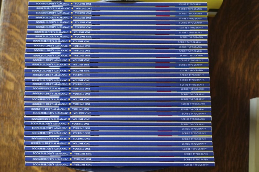
My assessment is that the problem is not that the cover is mounted incorrectly but that the bulk of the book varies. Some books are clearly fatter than others. Considering, the equipment does a good job of delivering books where the cover is not compromised by showing the spine and where the spines, well, appear on the spine. Take note as you design your spines. I recommend your spine color wrap around to the back, or be the same color as the back cover area.

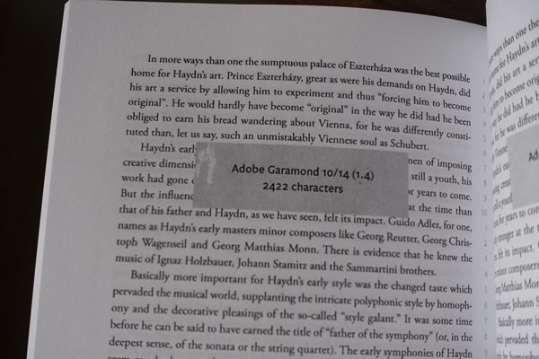
I found only one major printing flaw: a place where the toner had not fused to the paper:
Comment your address to me.