I received my first box of 4o copies of Bookbuilder’s Almanac: Volume One this week. I ordered these to send out to reviewers.
Up to now, I’ve only seen the book as a single-order printing. As you know, part of my objective with the Bookbuilder’s Almanac is to create a useful sample to show print quality.
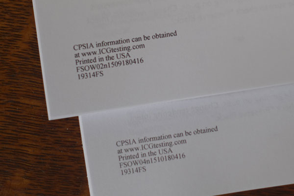
Imagine my surprise when I surveyed my books and discovered that 16 were printed with inkjet technology and the remaining 24 were printed with toner-based printers.

The toner versions are darker and sharper than the inkjet versions. The toner is shiny. The inkjet versions are smoother and not quite black enough. Some typefaces are better in one version than the other. Both versions have similar gray capacity.
[05.11.16: My friend Alan Gilbertson observed that the two versions are printed on different papers, “a fairly opaque bright white for the toner version and a much less opaque, lower-brightness stock for inkjet,” he wrote in an email to me].
I asked my Lightning Source rep if he had any insights as to why I received a shipment printed two different ways. His response echoed the information I had received from an Edwards Bros. digital printer at the Publishing Professional’s Network conference last week: These decisions are made at the manufacturing site based on maximizing resources.
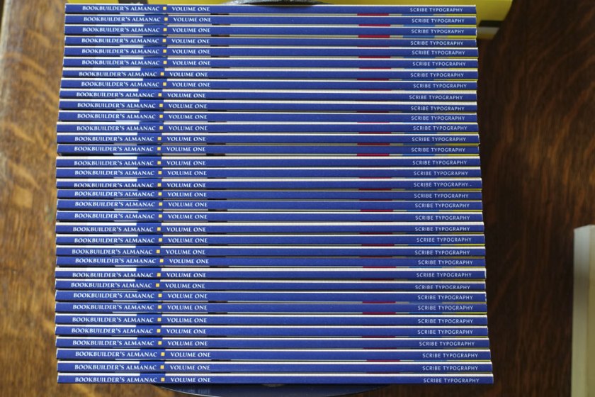
The Bookbuilder’s Almanac has a spine built to show clearly any deviation from the spine width provided by the manufacturer. Don’t design your book this way, especially for a skinny book!
In the photo below you can see where the tan front front cover was pulled on to the blue spine or where the back cover with the bright cyan, magenta, and yellow bars pulls from the back cover.

My assessment is that the problem is not that the cover is mounted incorrectly but that the bulk of the book varies. Some books are clearly fatter than others. Considering, the equipment does a good job of delivering books where the cover is not compromised by showing the spine and where the spines, well, appear on the spine. Take note as you design your spines. I recommend your spine color wrap around to the back, or be the same color as the back cover area.

I found only one major printing flaw: a place where the toner had not fused to the paper:

I would very much like to hear your stories about books you’ve received from Lightning Source. And, while I am promoting Bookbuilder’s Almanac: Volume One, I am giving away review copies.
Comment your address to me.

