Hierloom Books

Let’s make an heirloom book from your genealogy research, scrapbooks, photos, collected letters, or memoir.

Do you have genealogy research, or a collection of letters, poems, or photos that you would like to preserve as a book you can share? I can help you edit your material and form a book that will be a “keeper.” Here’s a recent project:

GoldofGreenstoneSQ550x
The Gold of Greenstone Glen, 5.5 x 8.5, 260 pages

From a box of mementos to a book

My client found the manuscript of a novel written by her ancestor. She wanted to make this special find something to share with her famiy as a book. She came to me asking if she could make 10 books bound in green leather.

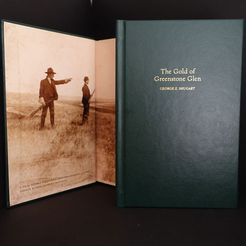
After seeing the manuscript, I suggested she write an Introduction for the book, with the story of how she found the manuscript, and any other information she wanted to add. She showed me a framed newspaper article written about her relative. It was illustrated with a map of his worldwide travels — and he went everywhere! My client also had a photograph of her relative: a hunting scene in a small sepia print.

That photo, enlarged, became the front endsheets. This worked out well because on the enlargement, it is possible to see the man’s features, now visible due to high-resolution printing. The back endsheets are filled with the family tree, with room for the grandchildren to fill in the new members as they pass the book along.

With the Introduction, photos, map, and the novel, someday when somebody finds the book in grandma’s garage, the book will tell the story on its own.

Editions as low as 10 copies

From a printing standpoint, the challenge was to find a way to do so few books, and to find a way to satisfy my client’s wish for leather-bound books. Fortunately it is easier than ever to print very small quantities of books.

EditionOne

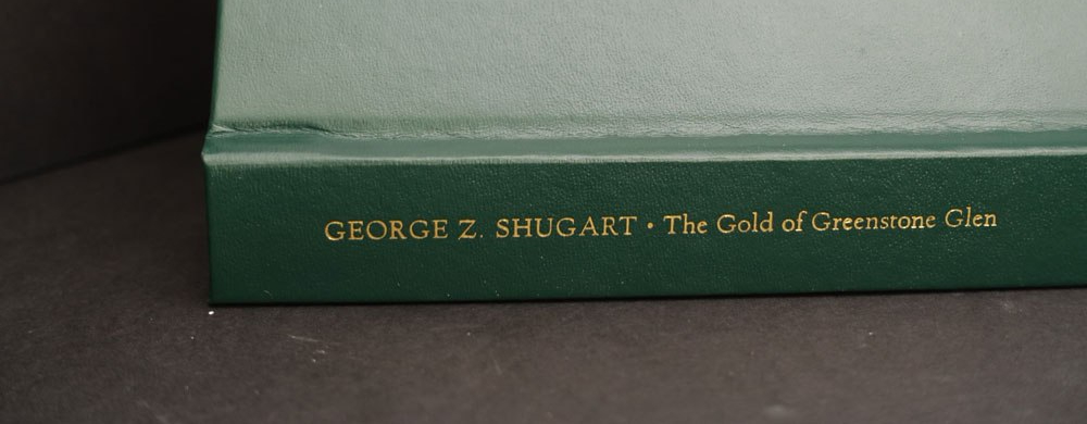
EditionOne is a quality digital print shop and bindery in Berkeley, CA. The Gold of Greenstone Glen is the first project I’ve done with them, and I hope to do many more. Their array of materials and finishes is a candy shop for book designers and they will produce as few as 10 books.

I visited their workshop to see examples of their work, and select a case material for my client’s book project. From their samples I could see that their bindery did a fabulous job: tight yet yielding binding, crisp foil stamping, and perfect detail work on corners and endsheets. With their guidance, I considered the leather and leatherlike options. I then explained the options to my client.

With relatively modest case stamping on leatherlike material, black and white interior, and color endsheets, we were able to keep the cost per book very close to $100/book.

Edition One provided proofs on the actual stock and produced the books in a timely manner. The books were packed beautifully in high-quality cartons.

Ready to make your heirloom?

Get in touch.

Anniversary Edition of a Classic: Part 2

What poetry books looked like in the 60s

A look at The Drunk in the Furnace (1960, The Macmillan Company) beside The Lice (Athaneum, 1967) gives a sense of how Merwin’s poetry books, and that of many other poets, looked in the 50s and changed in the 60s.

MerwinFurnaceLice
Fig. 1: The Drunk in the Furnace, 1960 with The Lice, 1967

Side by side, we can see that Harry Ford’s design is a departure from the corporate feeling of The Macmillan Poets series design (credit Gilbert Etheredge). Ford’s design embraces letterpress aesthetics with bold, traditional letterforms. The Macmillan book is perfect bound and glued. The poor quality paper is now browned with age. The Lice on the other hand, is on laid stock with sewn signatures. It opens and lays flat without breaking the spine. It is a nice book! The prices: $1.25 and $1.95. I’d say Ford gave us that extra 70 cents worth.

Take a look at the interiors. I’ve added a design from the 1950s on the left:

3bookComparison
Fig 2: At the left: Wallace Stevens, publshed by Knopf in 1952. In the middle: Merwin’s The Drunk in the Furnace, 1960. At the right: The Lice, 1967

In context, Harry Ford’s design belongs in the lineage of fine book design from Knopf (Atheneum was founded by Alfred A. Knopf, Jr. in  1959). Harry Ford had been a production manager at Knopf, but had been hired away to become production design director of the new Athaneum.

Known for his 1993 quip about poetry publishing: a money-losing proposition, Ford supported and edited poetry throughout his publishing career. The crafty exhuberance of his design for The Lice signals that the 1960s were in full bloom.

The Lice interior design uses metal-type thinking, i.e. common metal set sizes with even leading: 10/14 Bembo text, 14 pt cap italic titles and, notably, 14pt folios.* Everything hangs from the top of the page except second pages of poems and the epigram opposite the title page. The title page doesn’t center on the entire page, but is blocked up to the upper right. Seems a strange choice to my eye. My guess is that Harry Ford had a set of specs he handed to the compositor, and they took care of the rest. The frontmatter items have some interesting features, like the small cap book titles in the acknowledgments on the copyright page. There, someone seems to have given the work extra attention, and these pages are especially beautiful in the first edition, where the type was fresh and the paper stock fine.

*You can see those folios above in Figure 2. above. The page at the left shows the 14pt folio. These large folios were popular in the 60s-70s, and they have a certain appeal in that they show off the typeface’s numerals and make a nice anchor for the poetry page frame, which may have a large portion of whitespace. When I tried to use those anchor-sized numbers early in my career at Copper Canyon Press, Sam Hamill told me that he did NOT like them. So, I didn’t use them. I’ve come to agree with him that the large folios are a wayfinding element, outside the text, that has been made precious by the designer.

The Lice by W.S. Merwin: 50th Anniversary Edition

A great essay about Harry Ford and Cynthia Krupat, and how they are part of our experience of poetry

Read Part 1


Save

Luxury Matte and color shift

In the photo below, you can see how the color is darker and duller in the finished book  (left) than it is in the press approval proof (right) provided by the printer. The cover was printed offset (10pt C1S, 4/0) and finished with luxury matte coating.

comparison of color in matte lamination cover vs. pressmatch
Printed book with luxury matte coating on the left, matchprint from the printer on the right.

The printer always tells me that matte coatings will make the color darker, and it is useful to consider this side-by-side comparison. The cover stock is not as bright white as the proof stock. The cover stock is warmer (more yellow). So, some color shift is due to the difference in the stock.

On screen the image looks very bright (yes I know the screen doesn’t give an accurate color match). I had already made the image brighter and a bit more saturated to come closer to our expectations from the screen. I’m glad I did as the printed cover stepped it back down again.

Design note to self: Remember to think ahead and account for the likely difference between press proof and actual printed results.

Possible strategies: pull back the yellow 5%-10%, increase brightness and saturation, and in some circumstances pay for a proof on the actual stock for a better proof to begin with.

Box of books from Lightning Source

I received my first box of 4o copies of Bookbuilder’s Almanac: Volume One this week. I ordered these to send out to reviewers.

Up to now, I’ve only seen the book as a single-order printing. As you know, part of my objective with the Bookbuilder’s Almanac is to create a useful sample to show print quality.

Imagine my surprise when I surveyed my books and discovered that 16 were printed with inkjet technology and the remaining 24 were printed with toner-based printers.

InjetVSTonerx600
Toner based printing (top) vs. inkjet printing (bottom)

The toner versions are darker and sharper than the inkjet versions. The toner is shiny. The inkjet versions are smoother and not quite black enough. Some typefaces are better in one version than the other. Both versions have similar gray capacity.

[05.11.16: My friend Alan Gilbertson observed that the two versions are printed on different papers, “a fairly opaque bright white for the toner version and a much less opaque, lower-brightness stock for inkjet,” he wrote in an email to me].

I asked my Lightning Source rep if he had any insights as to why I received a shipment printed two different ways. His response echoed the information I had received from an Edwards Bros. digital printer at the Publishing Professional’s Network conference last week: These decisions are made at the manufacturing site based on maximizing resources.

The Bookbuilder’s Almanac has a spine built to show clearly any deviation from the spine width provided by the manufacturer. Don’t design your book this way, especially for a skinny book!

In the photo below you can see where the tan front front cover was pulled on to the blue spine or where the back cover with the bright cyan, magenta, and yellow bars pulls from the back cover.

SpineStackx1000
Spine variation of a box of books

My assessment is that the problem is not that the cover is mounted incorrectly but that the bulk of the book varies. Some books are clearly fatter than others. Considering, the equipment does a good job of delivering books where the cover is not compromised by showing the spine and where the spines, well, appear on the spine. Take note as you design your spines. I recommend your spine color wrap around to the back, or be the same color as the back cover area.

Spines1000x288
Binding variance over 40 books printed via Lightning Source.

I found only one major printing flaw: a place where the toner had not fused to the paper:

FlawX600
Flaw in a screened area from a toner printed book from Lightning Source.

I would very much like to hear your stories about books you’ve received from Lightning Source. And, while I am promoting Bookbuilder’s Almanac: Volume One, I am giving away review copies.

Comment your address to me.


Design Eye on AWP16

AWP2016 bookshow beautiful books and creative risks

Books I brought home from the large book fair at AWP 2016.
Gleanings from AWP 2016 book fair

I traversed the book fair floor with an eye to interesting covers and book forms. I was thrilled to see the beauty, the risks, and the variety of books brought to the AWP16 word party.

From top left to right:

Organic Weapons Arts (OW! Arts) out of Detroit produce 5.5 x 6.5 chapbooks that fall somewhere between trade books and handmade. Kudzu Does Not Bend by Jane Wong has an outsider-arts-and-crafts illustration on the cover.

Yes Yes Books is in the photo twice. Dream with a Glass Chamber by Aricka Foreman is a 5.5 x 6.5 chapbook that is so polished I hardly want to call it a chapbook. I’m a fan of Alban Fischer, the designer at Yes Yes, and he can’t help it but make a miniature jewel.

Siglio Press is in the photo three times because, well I just want to own every book on their table. Siglio books are singular because they are beautifully executed and are all doorways into extraordinary arts and minds. The colorful book peeking out at 12:00 in the photo is the ecstatic You Who Read Me with Passion Now Must Forever Be My Friends by Dorothy Iannone and edited by Lisa Pearson. Beauty beauty beauty!

Copper Canyon Press at 1:00 position, represented by So Much Synth by Brenda Shaugnessy. Love that “synth” image and the rich colors of the jacket front and back. The case is shiny gray. I have to say, Copper Canyon Press treats poetry very well. Hardcover poetry. Wow. Book design by Phil Kovacevich. (Full disclosure, CCP is my client)

Immediately below that is Lotería Huasteca: Woodblock Prints by Alec Dempster, Porcupine’s Quill Press. Every book on this publisher’s table had the same toothy paper and letterpressy feeling covers — and no wonder. Follow the links to see how they do it. The interior designs by Canada’s Tim Inkster.

To the right of the Lotería is Suite Vénitienne by Sophie Calle (Siglio). It has a gorgeous blue case with a die cut shaped like an eye, and reveals part of the photo on the flyleaf that provides the iris to complete the effect. And this isn’t just a cute device, it serves the work perfectly.

Next to the blue Suite, at 3:00 and 4:00 are books by Otis Books, the publishing arm of the Graduate Writing program at Otis College of Art and Design. Traditional typography and photography on the interiors, and always black covers. Propped open is Tlemcen or Places of Writing by Mohammed Dib. Below that, in black is Panic Cure: Poetry from Spain for the 21st Century edited by Forrest Gander. All the books are beautifully traditional, and it is good to know that there is a writing program like this one that show writing students how it’s done. They must chafe against those black covers though! . . . suppose it keeps them focused.

“And now for something completely different . . . ” Saturn, by Simon Jacobs published by Spork Press “Bound with prescriptions, dirt, Vangelis, help, more IPA, and Sander Monson Jr” as noted on the copyright page, the book feels simultaneously like a Little Golden Book (the cardboard binding) and a zine (the art). The people at the Spork table showed me a new, larger format product. This is so good, it has to be from Portland, but it isn’t. It comes from Tucson. Note to self: take another look at Tucson.

At 6 o’clock position is another Yes Yes book, this time 7″ x 9″ with fold-outs no less. Some Planet, by John Mortara

At 7 o’clock is Texas: The Great Theft by Carmen Boullosa published by Deep Vellum Publishing. Support literature in translation!

Finally, The Center is Barbaric, The Periphery is Without Lights by Tim Early, Doublecross Press, printed in daring letterpress, metallic silver on black on the cover and black on craft paper on the interior. Big lovely gothic letterforms. Typeset and printed at The Center for Book Arts, NYC by Anna Gurton-Wachter, MC Hyland, and Jeff Peterson.

Still lots more to digest from the feast of AWP2016. More soon.

Here’s a link to Part 2.


%d bloggers like this: