
Designing a refreshed, enhanced edition of W.S. Merwin’s The Lice
In 1967, Atheneum published the first hard and softcover editions of The Lice. I’ve been designing the new 50th Anniversary Edition for Copper Canyon Press, and the project has taken me down all kinds of interesting rabbit holes. I plan to post about a few of them.
Considering the original cover:
As delivery to the printer approaches, I am still trying to nail down the color for the cover. I thought I had it, based on two old copies I had, but then thought to look at a first printing to see what materials they used.
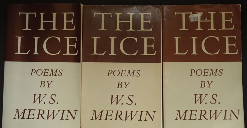
When my copy arrived, it seemed to me that the first printing was a different color than the later printings. Taking note of how yellowed the inside cover of the first printing appeared, I wondered if it had been printed on a natural white to start with?
It was difficult to match the color using my current Pantone Plus system swatch book book. In frustration I pulled out my very old Pantone CMYK book. There, I found some credible matches to the warmish greenish gray and the oxblood brown. I began to wonder if it wasn’t a good thing I’m too cheap throw out my old swatch books. Does the paper under the ink yellow as much as that without ink? Or perhaps, I was now thinking, each printing and even each copy had aged in its own way. . . .
Here is the first printing next to my Gracol6 proofs:
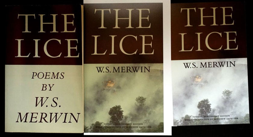
The updated proofs are in the middle and on the right. I hope those of you who remember the original paperback will immediately recognize that rad title, (there isn’t a poem named “The Lice” in the collection), while new readers will appreciate those gorgeous elegant Bembo caps, and be drawn in by the photo. The of burning village in Viet Nam suggests the context of the original and is also sadly like our own urgent canvas, with our great wildfires, and endless wars.
Monotype’s Bembo Titling caps are so graceful (look the serifs on the “C”), they are an improvement to the original, heavier Bembo caps. To my eye, the bottom half of the original with those cap italics, desperately needed an update. I’ve never been a fan of all cap italics. They are all over the interior, too . . .
I’m going to adjust the cover color one more time . . . I know, who even cares about this? {I do.} Who would ever notice? {Why I blog.}
