
Where Now by Laura Kasischke, Copper Canyon Press
Hardcover cases are almost always hidden under jackets. That’s a shame, since the skin of the book is where textures and colors add dimension to the book design.
The hardcover skin is a vestigial organ, and therefore a part of the book budget that gets squeezed early when cost is an issue.
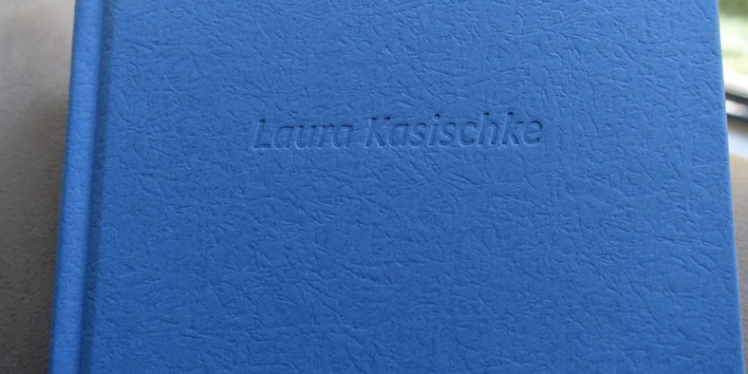
Here’s a simple case covered in textured paper with a dull silver embossed spine. This is about a basic as a case can get. The only “extras” here (in cost) are the two debosses: on the front cover, and on the lower back cover. Generally, a spine must have visible embossed text for the occasions when the book is separated from it’s clothing.
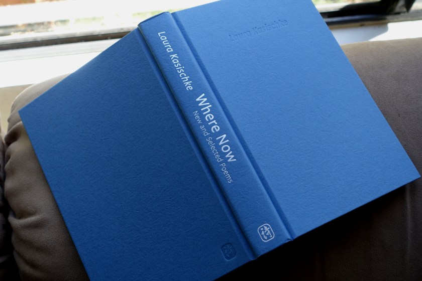
The texture of the paper, part of the standard textures offered by Rainbow, echoes the photo on the cover of the book, a mysterious cloth floating down a stream.
 Will anyone look at the binding? When I designed it, I liked to imagine author Laura Kasischke pealing back the jacket and admiring her own name, debossed on the cover: Her accomplishment.
Case binding by John H. Dekker & Sons of Grand Rapids, MI.
