Hardcover cases are almost always hidden under jackets. That’s a shame, since the skin of the book is where textures and colors add dimension to the book design.
The hardcover skin is a vestigial organ, and therefore a part of the book budget that gets squeezed early when cost is an issue.
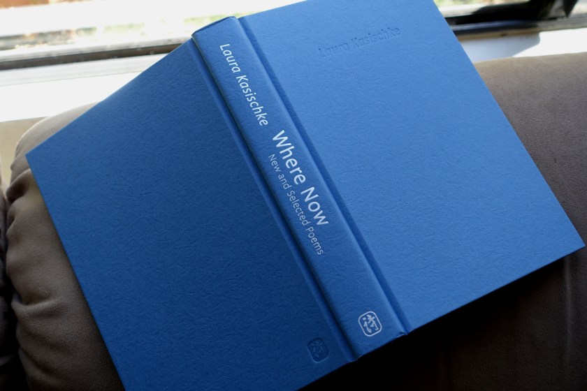
Here’s a simple case covered in textured paper with a dull silver embossed spine. This is about a basic as a case can get. The only “extras” here (in cost) are the two debosses: on the front cover, and on the lower back cover. Generally, a spine must have visible embossed text for the occasions when the book is separated from it’s clothing.
Where Now: New and Selected Poems by Laura Kasischke, published by Copper Canyon Press
The texture of the paper, part of the standard textures offered by Rainbow, echoes the photo on the cover of the book, a mysterious cloth floating down a stream.
Will anyone look at the binding? When I designed it, I liked to imagine author Laura Kasischke pealing back the jacket and admiring her own name, debossed on the cover: Her accomplishment.
Case binding by John H. Dekker & Sons of Grand Rapids, MI.
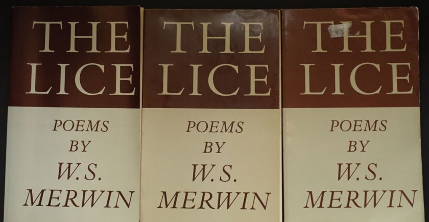
A look at The Drunk in the Furnace (1960, The Macmillan Company) beside The Lice (Athaneum, 1967) gives a sense of how Merwin’s poetry books, and that of many other poets, looked in the 50s and changed in the 60s.
Fig. 1: The Drunk in the Furnace, 1960 with The Lice, 1967
Side by side, we can see that Harry Ford’s design is a departure from the corporate feeling of The Macmillan Poets series design (credit Gilbert Etheredge). Ford’s design embraces letterpress aesthetics with bold, traditional letterforms. The Macmillan book is perfect bound and glued. The poor quality paper is now browned with age. The Lice on the other hand, is on laid stock with sewn signatures. It opens and lays flat without breaking the spine. It is a nice book! The prices: $1.25 and $1.95. I’d say Ford gave us that extra 70 cents worth.
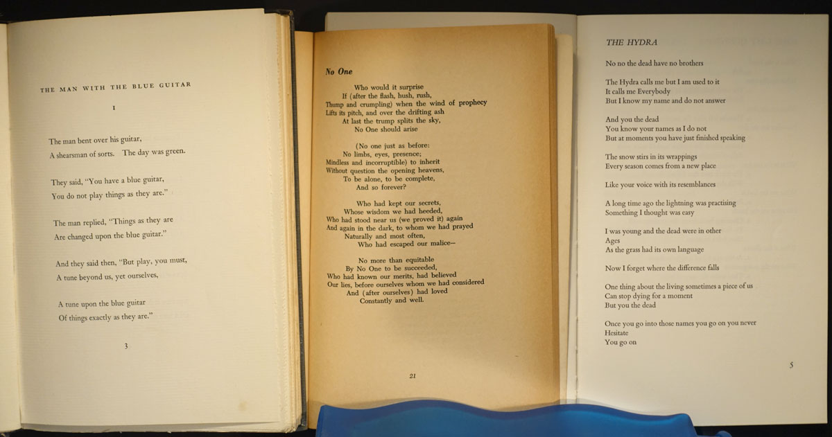
Take a look at the interiors. I’ve added a design from the 1950s on the left:
Fig 2: At the left: Wallace Stevens, publshed by Knopf in 1952. In the middle: Merwin’s The Drunk in the Furnace, 1960. At the right: The Lice, 1967
In context, Harry Ford’s design belongs in the lineage of fine book design from Knopf (Atheneum was founded by Alfred A. Knopf, Jr. in 1959). Harry Ford had been a production manager at Knopf, but had been hired away to become production design director of the new Athaneum.
Known for his 1993 quip about poetry publishing: a money-losing proposition, Ford supported and edited poetry throughout his publishing career. The crafty exhuberance of his design for The Lice signals that the 1960s were in full bloom.
The Lice interior design uses metal-type thinking, i.e. common metal set sizes with even leading: 10/14 Bembo text, 14 pt cap italic titles and, notably, 14pt folios.* Everything hangs from the top of the page except second pages of poems and the epigram opposite the title page. The title page doesn’t center on the entire page, but is blocked up to the upper right. Seems a strange choice to my eye. My guess is that Harry Ford had a set of specs he handed to the compositor, and they took care of the rest. The frontmatter items have some interesting features, like the small cap book titles in the acknowledgments on the copyright page. There, someone seems to have given the work extra attention, and these pages are especially beautiful in the first edition, where the type was fresh and the paper stock fine.
*You can see those folios above in Figure 2. above. The page at the left shows the 14pt folio. These large folios were popular in the 60s-70s, and they have a certain appeal in that they show off the typeface’s numerals and make a nice anchor for the poetry page frame, which may have a large portion of whitespace. When I tried to use those anchor-sized numbers early in my career at Copper Canyon Press, Sam Hamill told me that he did NOT like them. So, I didn’t use them. I’ve come to agree with him that the large folios are a wayfinding element, outside the text, that has been made precious by the designer.
The of burning village in Viet Nam suggests the context of the original and is also sadly like our own urgent canvas,with our great wildfires, and endless wars.
Designing a refreshed, enhanced edition of W.S. Merwin’s The Lice
In 1967, Atheneum published the first hard and softcover editions of The Lice. I’ve been designing the new 50th Anniversary Edition for Copper Canyon Press, and the project has taken me down all kinds of interesting rabbit holes. I plan to post about a few of them.
Considering the original cover:
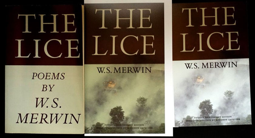
As delivery to the printer approaches, I am still trying to nail down the color for the cover. I thought I had it, based on two old copies I had, but then thought to look at a first printing to see what materials they used.
L to R: First, third and twelfth printings
When my copy arrived, it seemed to me that the first printing was a different color than the later printings. Taking note of how yellowed the inside cover of the first printing appeared, I wondered if it had been printed on a natural white to start with?
It was difficult to match the color using my current Pantone Plus system swatch book book. In frustration I pulled out my very old Pantone CMYK book. There, I found some credible matches to the warmish greenish gray and the oxblood brown. I began to wonder if it wasn’t a good thing I’m too cheap throw out my old swatch books. Does the paper under the ink yellow as much as that without ink? Or perhaps, I was now thinking, each printing and even each copy had aged in its own way. . . .
Here is the first printing next to my Gracol6 proofs:
L to Right: First, Gracol proof 2 (designed to be more tan), Gracol proof 1 (before I decided to make the bottom look more like the original book color)
The updated proofs are in the middle and on the right. I hope those of you who remember the original paperback will immediately recognize that rad title, (there isn’t a poem named “The Lice” in the collection), while new readers will appreciate those gorgeous elegant Bembo caps, and be drawn in by the photo. The of burning village in Viet Nam suggests the context of the original and is also sadly like our own urgent canvas, with our great wildfires, and endless wars.
Monotype’s Bembo Titling caps are so graceful (look the serifs on the “C”), they are an improvement to the original, heavier Bembo caps. To my eye, the bottom half of the original with those cap italics, desperately needed an update. I’ve never been a fan of all cap italics. They are all over the interior, too . . .
I’m going to adjust the cover color one more time . . . I know, who even cares about this? {I do.} Who would ever notice? {Why I blog.}
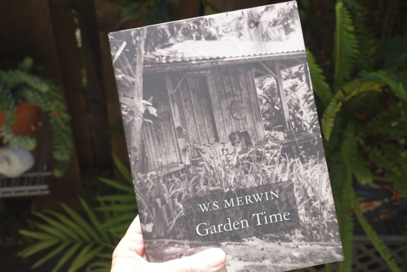
W.S. Merwin’s latest poetry from his palm sanctuary
W.S. Merwin turned 89 on September 30, 2016.
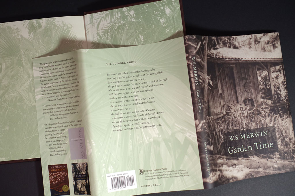
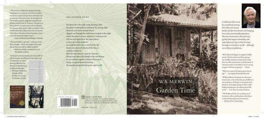
Garden Time by W.S. Merwin, Copper Canyon Press, 2016, ISBN 978155659-499-1
The cover image, a copperplate photogravure by Gwen Arkin, shows the potting shed on the land where W.S. Merwin lives, writing and tending a forest of palm trees that he planted, turning clear cut land into a forest. Sarah Cavanaugh‘s photographs are on the endsheets and on the back of the jacket. Merwin’s Maui forest is now The Merwin Conservancy.
Endsheets
Case in Rainbow “Handspun” texture with debossing and silver foil stamp on the spine
Merwin’s “Also By” takes up two pages
Interior
Merwin’s poetry asks for a classic, minimal setting. MVB Verdigris is the text typeface, with display type set in Garamond 3. The Garamond siblings are a nod to Merwin’s years living in France if anyone were to ask me why I picked them. If you listen to that clip under the “living in France” link you’ll hear: warmth and erudition are in Merwin’s voice as well as in Verdigris’ letterforms.
The real book is better than the pictures. 5.5 x 7.5 inches, soft to the touch, fits well in hand . . .
Cover and Jacket
The cover art led the way to an earthy, organic approach for the whole book package. For the forest photos by Sarah Cavanaugh, printing them in full color seemed too literal, and possibly overwhelming to the space of the poems. Instead those photos are presented in a muted green monotone. I used 4-color process for the green so I could attempt to make both greens match (the one printed on the creamier endsheet stock and the one printed on the white jacket stock). By pulling back the yellow a bit on the endsheet green, the result matches well enough.
The original cover concept was whisper spare. Just the simple author/title. No enhancement. Test prints and common-sense talk* from JB the seasoned marketer convinced me that we had to make it possible to read the author/title from a distance. I used an understated intervention, a brown rectangle made from the image of a palm leaf.
*actually a passionate plea
Better choice?
Bloodaxe in Britain has released Garden Time in softcover. Their approach to the cover is a bit different, although they use the same image as a starting point.
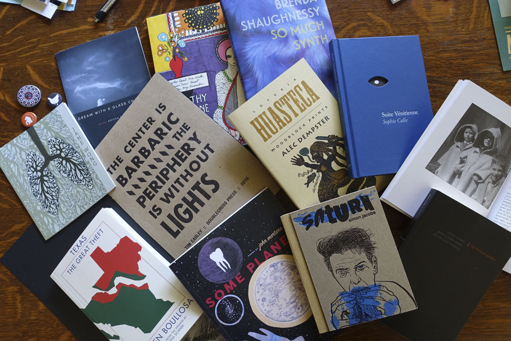
AWP2016 bookshow beautiful books and creative risks
Gleanings from AWP 2016 book fair
I traversed the book fair floor with an eye to interesting covers and book forms. I was thrilled to see the beauty, the risks, and the variety of books brought to the AWP16 word party.
From top left to right:
Organic Weapons Arts (OW! Arts) out of Detroit produce 5.5 x 6.5 chapbooks that fall somewhere between trade books and handmade. Kudzu Does Not Bend by Jane Wong has an outsider-arts-and-crafts illustration on the cover.
Yes Yes Books is in the photo twice. Dream with a Glass Chamber by Aricka Foreman is a 5.5 x 6.5 chapbook that is so polished I hardly want to call it a chapbook. I’m a fan of Alban Fischer, the designer at Yes Yes, and he can’t help it but make a miniature jewel.
Siglio Press is in the photo three times because, well I just want to own every book on their table. Siglio books are singular because they are beautifully executed and are all doorways into extraordinary arts and minds. The colorful book peeking out at 12:00 in the photo is the ecstatic You Who Read Me with Passion Now Must Forever Be My Friends by Dorothy Iannone and edited by Lisa Pearson. Beauty beauty beauty!
Copper Canyon Press at 1:00 position, represented by So Much Synth by Brenda Shaugnessy. Love that “synth” image and the rich colors of the jacket front and back. The case is shiny gray. I have to say, Copper Canyon Press treats poetry very well. Hardcover poetry. Wow. Book design by Phil Kovacevich. (Full disclosure, CCP is my client)
Immediately below that is Lotería Huasteca: Woodblock Prints by Alec Dempster, Porcupine’s Quill Press. Every book on this publisher’s table had the same toothy paper and letterpressy feeling covers — and no wonder. Follow the links to see how they do it. The interior designs by Canada’s Tim Inkster.
To the right of the Lotería is Suite Vénitienne by Sophie Calle (Siglio). It has a gorgeous blue case with a die cut shaped like an eye, and reveals part of the photo on the flyleaf that provides the iris to complete the effect. And this isn’t just a cute device, it serves the work perfectly.
Next to the blue Suite, at 3:00 and 4:00 are books by Otis Books, the publishing arm of the Graduate Writing program at Otis College of Art and Design. Traditional typography and photography on the interiors, and always black covers. Propped open is Tlemcen or Places of Writing by Mohammed Dib. Below that, in black is Panic Cure: Poetry from Spain for the 21st Century edited by Forrest Gander. All the books are beautifully traditional, and it is good to know that there is a writing program like this one that show writing students how it’s done. They must chafe against those black covers though! . . . suppose it keeps them focused.
“And now for something completely different . . . ” Saturn, by Simon Jacobs published by Spork Press “Bound with prescriptions, dirt, Vangelis, help, more IPA, and Sander Monson Jr” as noted on the copyright page, the book feels simultaneously like a Little Golden Book (the cardboard binding) and a zine (the art). The people at the Spork table showed me a new, larger format product. This is so good, it has to be from Portland, but it isn’t. It comes from Tucson. Note to self: take another look at Tucson.
At 6 o’clock position is another Yes Yes book, this time 7″ x 9″ with fold-outs no less. Some Planet, by John Mortara
At 7 o’clock is Texas: The Great Theft by Carmen Boullosa published by Deep Vellum Publishing. Support literature in translation!
Finally, The Center is Barbaric, The Periphery is Without Lights by Tim Early, Doublecross Press, printed in daring letterpress, metallic silver on black on the cover and black on craft paper on the interior. Big lovely gothic letterforms. Typeset and printed at The Center for Book Arts, NYC by Anna Gurton-Wachter, MC Hyland, and Jeff Peterson.
Still lots more to digest from the feast of AWP2016. More soon.
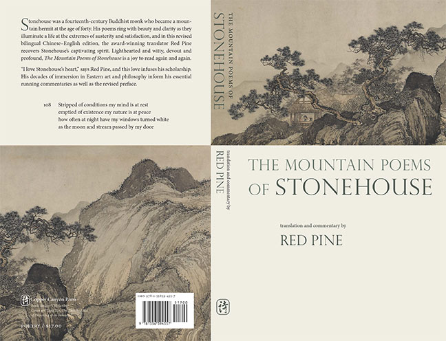
The Mountain Poems of Stonehouse, translation and commentary by Red Pine published by Copper Canyon Press.
Thinking of Eric Gill, and his background as a stonecutter, I set the book title with Gill’s beautiful Perpetua Titling capitals. I fell in love with the shapes of the letters, I admit.
Then, we found the image of the man in his simple hut, in the midst of dragon-shape pine trees. After acquiring the image rights, we learned that this scene was a detail from the familiar painting, “The Thatched Hut of Dreaming an Immortal” by Tang Yin (late 16th C), the wide painting depicts a man hovering in space at the left side. The Immortal hovers just beyond the book cover too.
The interior design balances the vertical lines of Chinese and the dense commentary on the verso pages with the poem number and translation on the recto page. All along, we wanted to keep the attention on the poems, with no more than 2 poem per spread.
I selected Minion for the text, as the sections of commentary can be long and we had limited space. Minion is slightly condensed so fits more words on the page than Bembo (another face I considered). Why not Perpetua for the text? Aside from the problem of fitting commentary, I don’t use Perpetua anymore for text because it falls apart when printed POD, and even though this book was printed on web press (at McNaughton and Gunn), you never know how the text may be printed in future.
Copious notes and commentary are part of what make Red Pine’s books so great.Stonehouse: The page has to work with less text, too.
Multilingual books are always full of puzzles to solve. In this case the poems contain some archaic characters, so we relied on a compositor in Taiwan to compose the Chinese. Delivered as a PDF, each page contained several poems. I placed the PDF and cropped out the other poems. Midway through, the Chinese compositor changed the spacing and organization of the source pdf changed. Aargh! I had to relink and check and recrop all those text boxes. What are blogs for if not for complaining, right?
I’ll end with one of my favorite poems from this collection:
Poem 13 by Stonehouse, translated by Red Pine
To buy a copy of the book, buy direct from Copper Canyon Press, or browse your local bookseller.

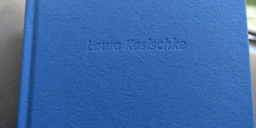
 Will anyone look at the binding? When I designed it, I liked to imagine author Laura Kasischke pealing back the jacket and admiring her own name, debossed on the cover: Her accomplishment.