Yes, there is a Little Free Library in front of Third Man Records
If you love music, books, and design: you MUST visit Third Man Records. Third Man in Nashville is a performace space, recording studio, and publishing house.
Everything about this place is gorgeous — the retro-moderne exterior, the interior with bold red and yellow walls and chrome accents everywhere. The store itself stocks a collectable range of merchandise. Browse bins of records, unique books, tee shirts, pins, matchbooks. You’ll be amazed by exquisite boxed sets of recordings. Everything about Third Man is designed and executed with spirit and daring.
I wasn’t allowed to photograph the spaces beyond the shop, where the red-black-yellow motif continues through a hall with Jack White concert posters varnished to the wall. Our guide led us past the vintage kitchen (more polished chrome), past a lounge with sofa and a coffee table covered with a huge rhino skull (or was it a triceritops fossil?).
Even the warehouse has design game, with orderly racks and boxes on one side, and on the other, balcony with faux motel numbered doors (and some bullet holes), as though you were on tour and this the dive where you would crash.
This sounds gooood!
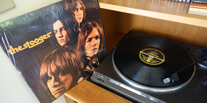
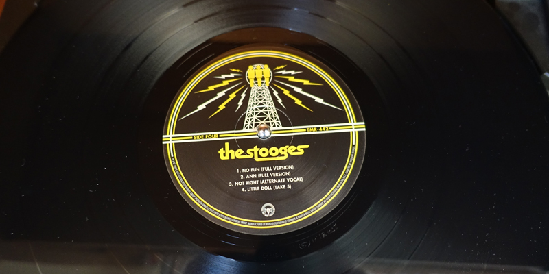
I was very lucky to come home with The Stooges in my suitcase. I’ve always wanted a chance to get to know this band that so many list as the first to do punk or fuzzed-out guitar or Dub Step or . . . I can now testify: They are right! Ron Asheton has finally arrived in my personal list of greatest guitar players of all time.
The Third Man re-issue is pressed on a heavy grade vinyl that reminds me 78s. It is a real pleasure to put these platters on the turntable. Some of Third Man’s pressings are on different colors of vinyl, too. I’ve been drooling over the Paramount boxed sets. Look at the Wonder Cabinet (vol 1) or Volume 2. Seriously excellent!
The of burning village in Viet Nam suggests the context of the original and is also sadly like our own urgent canvas,with our great wildfires, and endless wars.
Designing a refreshed, enhanced edition of W.S. Merwin’s The Lice
In 1967, Atheneum published the first hard and softcover editions of The Lice. I’ve been designing the new 50th Anniversary Edition for Copper Canyon Press, and the project has taken me down all kinds of interesting rabbit holes. I plan to post about a few of them.
Considering the original cover:
As delivery to the printer approaches, I am still trying to nail down the color for the cover. I thought I had it, based on two old copies I had, but then thought to look at a first printing to see what materials they used.
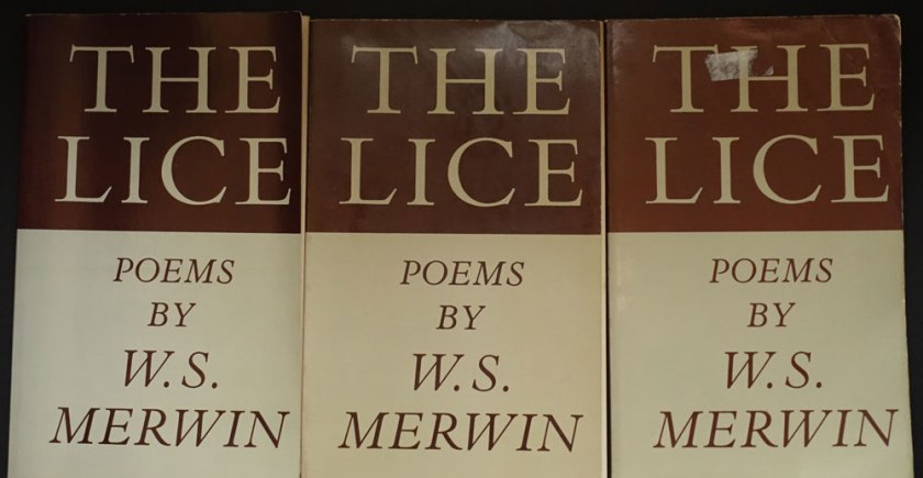
L to R: First, third and twelfth printings
When my copy arrived, it seemed to me that the first printing was a different color than the later printings. Taking note of how yellowed the inside cover of the first printing appeared, I wondered if it had been printed on a natural white to start with?
It was difficult to match the color using my current Pantone Plus system swatch book book. In frustration I pulled out my very old Pantone CMYK book. There, I found some credible matches to the warmish greenish gray and the oxblood brown. I began to wonder if it wasn’t a good thing I’m too cheap throw out my old swatch books. Does the paper under the ink yellow as much as that without ink? Or perhaps, I was now thinking, each printing and even each copy had aged in its own way. . . .
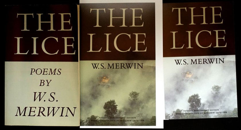
Here is the first printing next to my Gracol6 proofs:
L to Right: First, Gracol proof 2 (designed to be more tan), Gracol proof 1 (before I decided to make the bottom look more like the original book color)
The updated proofs are in the middle and on the right. I hope those of you who remember the original paperback will immediately recognize that rad title, (there isn’t a poem named “The Lice” in the collection), while new readers will appreciate those gorgeous elegant Bembo caps, and be drawn in by the photo. The of burning village in Viet Nam suggests the context of the original and is also sadly like our own urgent canvas, with our great wildfires, and endless wars.
Monotype’s Bembo Titling caps are so graceful (look the serifs on the “C”), they are an improvement to the original, heavier Bembo caps. To my eye, the bottom half of the original with those cap italics, desperately needed an update. I’ve never been a fan of all cap italics. They are all over the interior, too . . .
I’m going to adjust the cover color one more time . . . I know, who even cares about this? {I do.} Who would ever notice? {Why I blog.}
Here’s a treasure from my hoard, a gorgeous type specimen for the Lanston Type Co. printed 25 years ago. Still inspiring!
Caslon No. 337 and Fleurons
Goudy Initials
The Fount masthead, first issue, 1991
The Fount, Volume 1, Issue 1, Gerald Giampa designer, The Northland Letterpress Co. Ltd. Publisher, 1991. Tabloid size, newsprint.
From the history on MyFonts.com: “Lanston continued supplying the American market for Monotype casters until January 21, 2000, when the hot-metal component of Lanston was tragically destroyed by a tidal wave. After this time Giampa, who was one of the earliest developers of PostScript fonts, focused much more on digitization.”
From the masthead: “We trust you will accept our efforts to entertain, to appeal to your eye, and to provide you with accurate historical and technical information which will assist with your work in the world of late 20th Century Typography.”
AWP2016 bookshow beautiful books and creative risks
Gleanings from AWP 2016 book fair
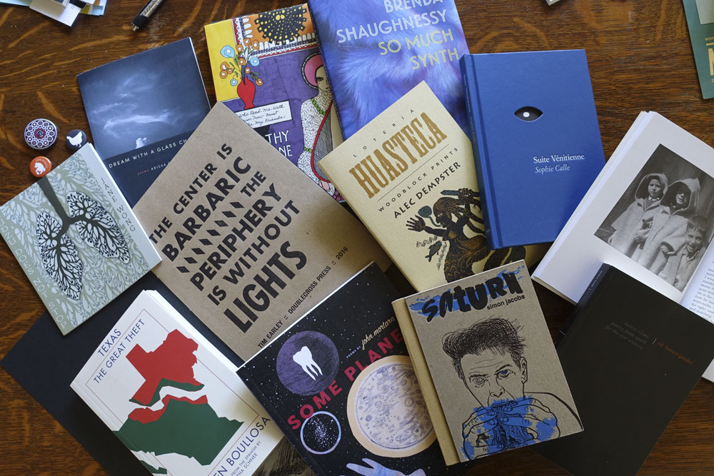
I traversed the book fair floor with an eye to interesting covers and book forms. I was thrilled to see the beauty, the risks, and the variety of books brought to the AWP16 word party.
From top left to right:
Organic Weapons Arts (OW! Arts) out of Detroit produce 5.5 x 6.5 chapbooks that fall somewhere between trade books and handmade. Kudzu Does Not Bend by Jane Wong has an outsider-arts-and-crafts illustration on the cover.
Yes Yes Books is in the photo twice. Dream with a Glass Chamber by Aricka Foreman is a 5.5 x 6.5 chapbook that is so polished I hardly want to call it a chapbook. I’m a fan of Alban Fischer, the designer at Yes Yes, and he can’t help it but make a miniature jewel.
Siglio Press is in the photo three times because, well I just want to own every book on their table. Siglio books are singular because they are beautifully executed and are all doorways into extraordinary arts and minds. The colorful book peeking out at 12:00 in the photo is the ecstatic You Who Read Me with Passion Now Must Forever Be My Friends by Dorothy Iannone and edited by Lisa Pearson. Beauty beauty beauty!
Copper Canyon Press at 1:00 position, represented by So Much Synth by Brenda Shaugnessy. Love that “synth” image and the rich colors of the jacket front and back. The case is shiny gray. I have to say, Copper Canyon Press treats poetry very well. Hardcover poetry. Wow. Book design by Phil Kovacevich. (Full disclosure, CCP is my client)
Immediately below that is Lotería Huasteca: Woodblock Prints by Alec Dempster, Porcupine’s Quill Press. Every book on this publisher’s table had the same toothy paper and letterpressy feeling covers — and no wonder. Follow the links to see how they do it. The interior designs by Canada’s Tim Inkster.
To the right of the Lotería is Suite Vénitienne by Sophie Calle (Siglio). It has a gorgeous blue case with a die cut shaped like an eye, and reveals part of the photo on the flyleaf that provides the iris to complete the effect. And this isn’t just a cute device, it serves the work perfectly.
Next to the blue Suite, at 3:00 and 4:00 are books by Otis Books, the publishing arm of the Graduate Writing program at Otis College of Art and Design. Traditional typography and photography on the interiors, and always black covers. Propped open is Tlemcen or Places of Writing by Mohammed Dib. Below that, in black is Panic Cure: Poetry from Spain for the 21st Century edited by Forrest Gander. All the books are beautifully traditional, and it is good to know that there is a writing program like this one that show writing students how it’s done. They must chafe against those black covers though! . . . suppose it keeps them focused.
“And now for something completely different . . . ” Saturn, by Simon Jacobs published by Spork Press “Bound with prescriptions, dirt, Vangelis, help, more IPA, and Sander Monson Jr” as noted on the copyright page, the book feels simultaneously like a Little Golden Book (the cardboard binding) and a zine (the art). The people at the Spork table showed me a new, larger format product. This is so good, it has to be from Portland, but it isn’t. It comes from Tucson. Note to self: take another look at Tucson.
At 6 o’clock position is another Yes Yes book, this time 7″ x 9″ with fold-outs no less. Some Planet, by John Mortara
At 7 o’clock is Texas: The Great Theft by Carmen Boullosa published by Deep Vellum Publishing. Support literature in translation!
Finally, The Center is Barbaric, The Periphery is Without Lights by Tim Early, Doublecross Press, printed in daring letterpress, metallic silver on black on the cover and black on craft paper on the interior. Big lovely gothic letterforms. Typeset and printed at The Center for Book Arts, NYC by Anna Gurton-Wachter, MC Hyland, and Jeff Peterson.
Still lots more to digest from the feast of AWP2016. More soon.
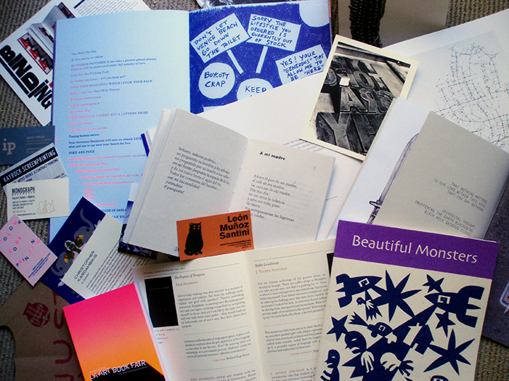
Yesterday I spent the day at Printed Matter’s LA Art Book Fair at the Geffen Contemporary at MOCA. Here are some of the books and ephemera I brought home:
Books and ephemera from the LA Art Book Fair, 2014*
If you have a chance, get down there to see it tonight or tomorrow! The Fair is full of creative energy with visual and tactile excitement. This isn’t a fair of stodgy conservative expensive fine editions, although there are a few example of that. This fair celebrates the creative adventure of making books and shows the work of first-time as well as seasoned publishers.
Over 200 exhibitors show off their books, zines, posters, wall paper and ephemera. Artists and produces are there at the tables. With your attention focused in the strange and exciting world of an artist book, or engaged in conversation with a creator, you’ll emerge refreshed by the vitatlity of the book arts!
*Books and ephemera including clockwise from bottom Beautiful Monsters: Paper cuttings by Jad Fair produced by Knust/Extrapool; Otis Books catalog by Rebecca Chamlee; Mahmoud Darwish: Once poemas produced by crc (Casa Refugio Citalaltépetl); Venice Beach Biannual 2012 by Lisa Anne Auerbach, Robby Herbst, Kimberly Varella; Everything Sings: Maps for a Narrative Atlas by Denis Wood produced by Siglio Press. NIH NIH by Miniature Garden (Jamie Stewart, Denise Schatz, Casey Cook)
Everything you need to know is in this book. This book is beautifully designed and printed. The books have a ribbon bookmark. Mine is set on the spread of ratios. At one time I worked through the math and proportions for every book I designed. Eventually, I had a body of experience that I could refer to — templates, notes, and printed results of my efforts. At this point, amazingly enough, some of it now part of my own body. That is, I can amaze myself by drawing boxes or choosing positions on the page that turn out to be in proportion if I check the math. I’ve absorbed the aesthetic.
This great book appears to be out of print. I have a copy that was issued by Chronicle Books in 1993. The process and methods in the book are pre-desktop computing. The book is richly illustrated with examples of book design from the 1960. Adrian Wilson worked at a time when comping was done by hand and the designer communicated their vision to various craftspeople who worked in other buildings or other towns. Those methods enforced a clarity of vision that we do not need in a world where we can create a visual faster than we can imagine it. Covers type, papers, binding, boxes for limited editions — I return to this book again and again for inspiration.
This one is out of print too. Guess that says a lot right there. This collection of essays covers typography and the materials of book production. I have a flag on the page about footnotes. Between Bringhurst and Tschichold, you can learn everything you need about setting beautiful type