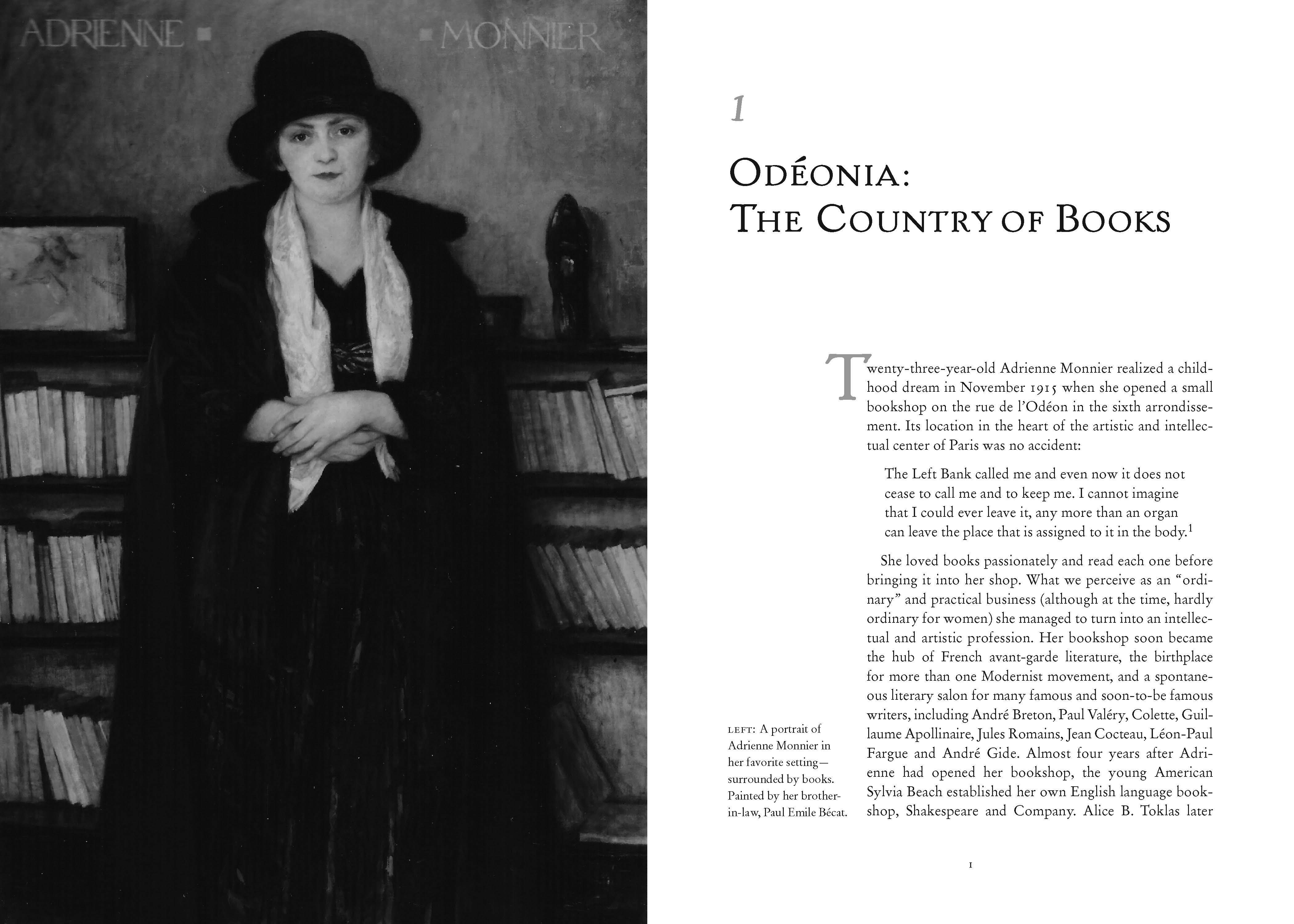
In 2013, Counterpoint Press asked me to design the reissue of Andrea Weiss’ richly illustrated history of the Paris cultural scene in the 1920s and 30s.

About the design
The book includes many illustration in the form of photographs and documents. I was grateful for the previous editions as they provided a plot to follow for the sequence of the illustrations. The trim size was different from the previous, and the schedule was short. I knew I had to accomplish the best layout on the first page proof as there wasn’t time to rework. I chose a 5 column grid for a lively asymmetry.
To approach the text design, I did some research. As usage lags invention, typography from the Belle Epoque and were still used in signage and publications from the time covered by the book, so I included those influences in my type palette. I used Fontshop’s FontBook app to browse typefaces designed in the 1910-1940 period.
For the text I chose Stemple Garamond, a beautiful Garamond (Stemple, 1924). I like to think that the date a typeface is created has some of the DNA of its time. For the display type, I chose Handle Oldstyle (1917), designed by a rare woman typographer. Handle pairs nicely with the letterforms of the Garamond.
For subheads and running feet I chose Cooper Oldstyle Italic, a stalwart of advertising of the time period, and Quadraat. Quadraat Sans has a bit of deco in it and a bit of warmth.

 Handle Oldstyle
 Quadraat Sans Semibold
 Cooper Oldstyle Italic
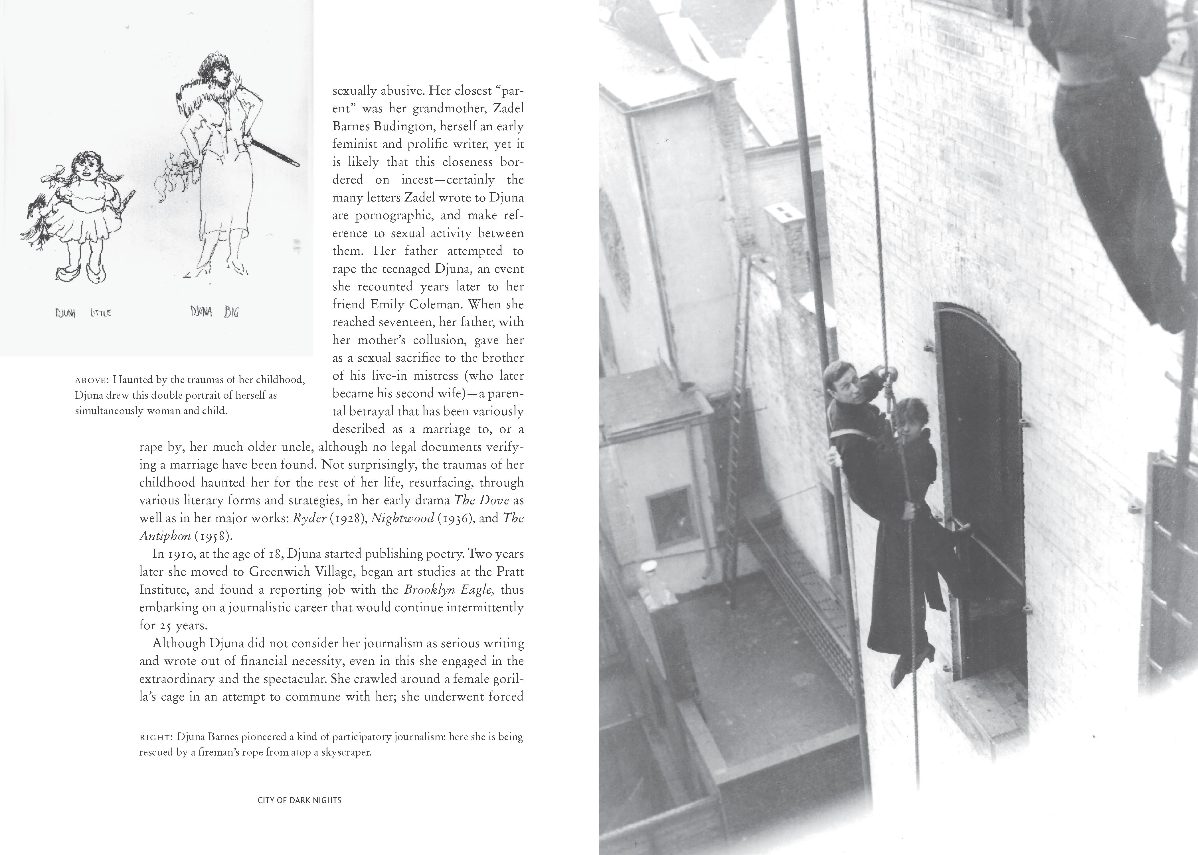
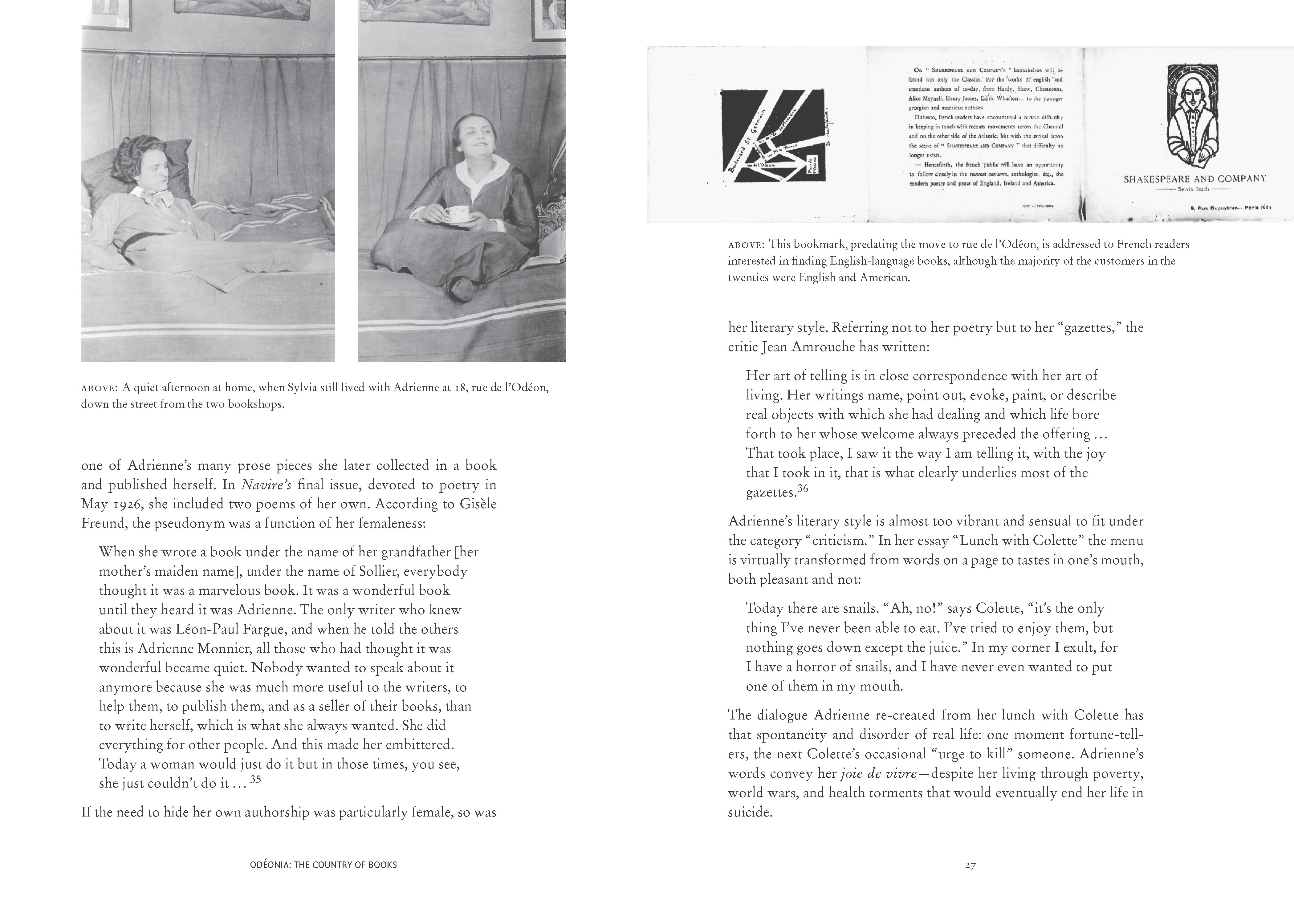
Many of the photos were scanned from books, or rough scans from the photos and so needed attention to adjust the gray tones and bring details out of the shadows.
This is a wonderful book. While I was familiar with Gertrude Stein and Shakespeare Books, there were many other women, such as Janet Flanner and Djuna Barnes, who contributed to the cultural milieu that was expat Paris in the 1930s.
Here’s a link to the author’s website, where there is a link to purchase the book:
andreaweiss.net/books/paris-was-a-woman/
