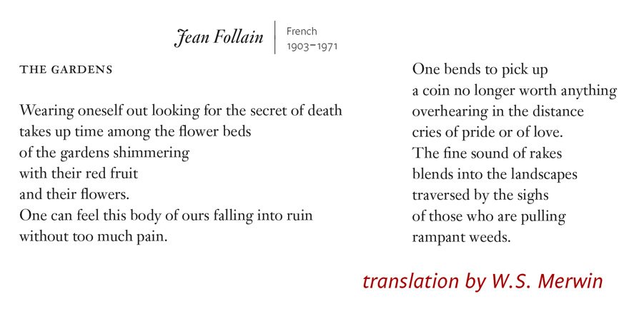
Thanks for the poems and the translations. Be well.
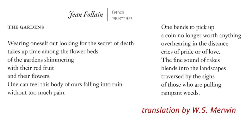
Thanks for the poems and the translations. Be well.
I know, AWP16 is so #LastWeek.
Want to mention a few more design finds. Two publishers caught my eye because of their great cover programs.

Open Letter Books has a wonderful set of covers, all made with simple illustration type and color. Have to admire the creativity there. Open Letter is a literary translation press out of Rochester University. Ann Zylicz is the designer of at least some of those books.
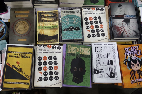
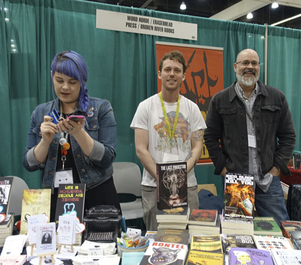
Broken River Books had a table of great book covers playing off of vintage cover design, often in a weathered grungy treatment.
Finally, some striking broadsides caught my eye and led me to conversation with Doncarlos Price about Public Pool. PublicPool.org “One Space for All Poets” has a dynamic visual presence, announces a future podcast and takes video submission along with written submission. Take a look.

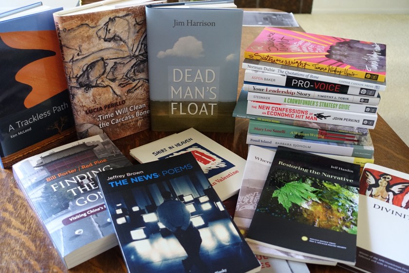
Last year I was busy, with over 20 projects reaching the printer/distributor over the calendar year.
Themes: More interest in unusual treatments, more working directly with authors.
Most notable project: Finding Them Gone by Red Pine/Bill Porter, Copper Canyon Press. 400 pages, over 120 black and white photos, poems in Chinese with English translation. I had a great deal of design latitude over what photos to include and how to present the material. This book turned into a true labor of love for VJB/Scribe and for the team at Copper Canyon Press.
Most traditional book interior: Sense of the Whole, Counterpoint Press. VJB/Scribe handled the design and layout of the interior, up to the backmatter which was added after hand-off.
Changes in the industry: Publishers continue to lower their production standards. Lithocases are replacing jacketed hardcovers, paper is replacing cloth over boards. Digital printing is so good most people can’t tell the difference. POD has improved some, but, most people don’t notice that either! Color is whatever it turns out to be.
PDF commenting seems to have been adopted by everyone, at least on one side of the digital divide. Since it actually takes longer to make changes communicated that way (I’ll write a separate post about that), we’ve gone backwards just to be digital. Not the first time!
Since I’m updating my blog, that must mean I have time for your project in my schedule. Get in touch!
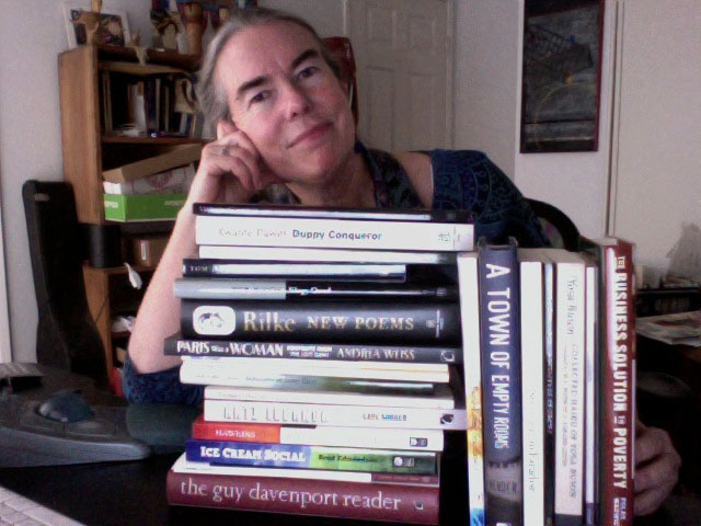
I feel satisfied that my time was well spent when I stack the books I helped publish in 2013.
This “shelfie” includes titles from Copper Canyon Press, Counterpoint, Berrett-Koehler, Westchester State University, American Poetry Review, Silverfish Review Press, FamilyWealth Consulting, and Unfettered Mind Media.
Contact me about your publishing project and add your book to the stack this year!
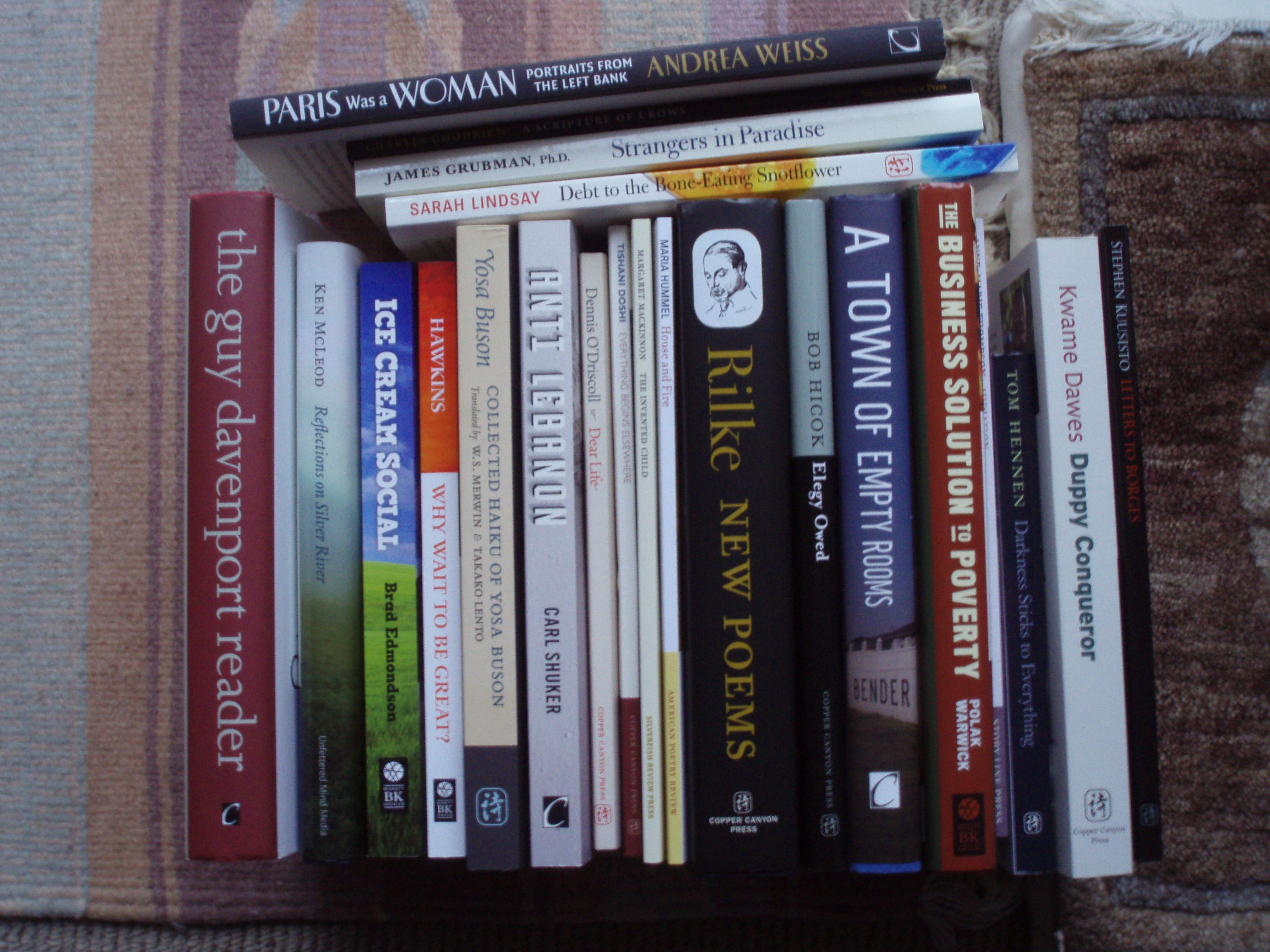
You can read the titles better here:
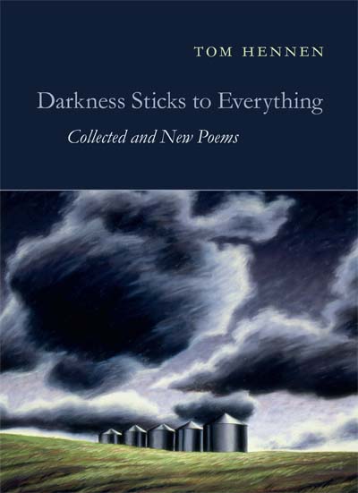
It has been an exciting week, with a review of Tom Hennen’s Darkness Sticks to Everything in the New York Times along with a photo of the book.
While designing the book, I grew to love the poems and have been telling all my poetry friends to read Tom Hennen. Well, the book is now out, and I hope is reaching many new readers.
For this title, we found another great cover image in the work of Susan Bennerstrom. I chose a smaller trim size, that fits the generally brief poems and prose poems well. You might even carry this in your coat pocket.

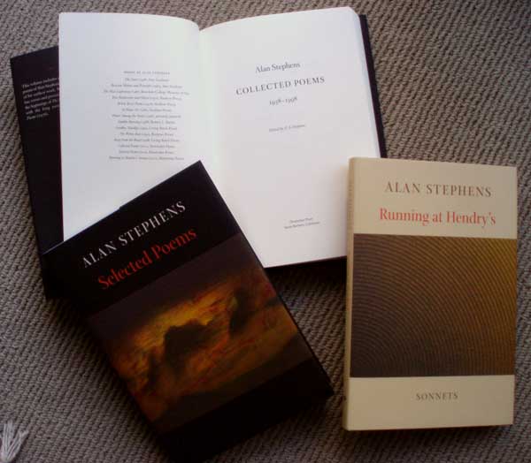
Today, I received the results of 2 years’ work: three volumes of poetry by Alan Stephens, edited by his son, Alan Archer Stephens. There are a few poems by Alan Stephens on the web here, and a beautiful website about the books is here at alanstephenspoems.com.
This book project was unusual in that we pursued excellence in a way that publishing ventures rarely do.
I centered the poems on the page for nearly 1000 pages of poems. Nobody is crazy enough to do that anymore. There are lots of complicated hierarchies of things — part titles, subtitles, part title epigrams, poem part titles, poem subtitles . . . lots of things to obsess over. And we did. By printing single books at LightningSource (now Ingram), we were able to make adjustments and perfect even more details.
Today I held those hardcovers for the first time. The book makes it possible for me to read the writing in a way I couldn’t while it was onscreen, or on single letter-size pages. I found I was reading, enjoying, and then had tucked the jacket flap in as a bookmark so I could read the poem again next time I opened the book. Books really are a wonderful technology.
We built these books to last, and I believe they have the qualities that will make them stay in book collections for a long time.
VJBScribe designed and composed the books. Dowitcher Press handled printing, fulfillment and marketing. Some information about ordering books is here.
Collected Poems: 1958–1998
Selected Poems
Running at Hendrys: Sonnets
by Alan Stephens
Limited edition hardcovers available from Dowitcher Press
